Code
# renv::install("gt")
# renv::install("ggplot2")
# renv::install("patchwork")

library(gt)
library(ggplot2)
library(patchwork)

source("functions.R") # load functions defined in prior chaptersWe install and load the necessary packages, along with functions and data from prior chapters.
# renv::install("gt")
# renv::install("ggplot2")
# renv::install("patchwork")
library(gt)
library(ggplot2)
library(patchwork)
source("functions.R") # load functions defined in prior chaptersIn the Visualize chapter, we will perform some EDA (Exploratory Data Analysis) to get a sense of what our data looks like. Specifically, we will see if there are any patterns or trends that may be useful to know about for the Transform and Model chapters.
Recall that the number of rounds and number of picks in each round have both changed as franchises have been added. A consequence of this is that the number of rounds has also changed, and the number of total picks in a draft has changed several times throughout our dataset. Recall that we removed all picks after #224, but there could be drafts with fewer than 224 total selections. The number of picks in each draft in our dataset is given in Figure 5.3.1.1:
all_data |>
  group_by(year) |>
  summarize(num_picks = n()) |>
  ggplot(aes(x = year, y = num_picks)) +
  geom_point() +
  labs(title = "Number of Picks in Each Draft in our Dataset",
       x = "Number of Picks", y = "Year",
       caption = "Figure 5.3.1.1: Number of Picks in Each Draft")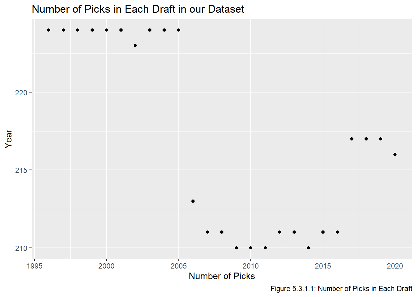
We see that the drafts after 2005 all have fewer than 224 selections. Recall that 2002 had an invalid pick and 2011 had a forfeited pick, neither is included in this. Some drafts having fewer pick is not a major problem since very late picks aren’t worth very much anyway, but it is worth noting that several picks from #211 onward have a smaller sample size than picks 1-210.
Before doing any further EDA, we will take the five number summary, mean, and standard deviation of both the GP and PS values to get a sense of what they look like. Recall that the five number summary gives the minimum, 25% quantile, median, 75% quantile, and maximum of a dataset. Additionally, recall that PS is a measure of a player’s career contributions to points in the standings (ie the points you get from wins, not the points that is goals plus assists).
c("five num" = fivenum(all_data$gp), "mean" = mean(all_data$gp), "sd" = sd(all_data$gp))five num1 five num2 five num3 five num4 five num5 mean sd
0.0000 0.0000 0.0000 145.0000 1779.0000 142.8240 274.0671 c("five_num" = fivenum(all_data$ps), "mean" = mean(all_data$ps), "sd" = sd(all_data$ps)) five_num1 five_num2 five_num3 five_num4 five_num5 mean sd
0.000000 0.000000 0.000000 3.000000 217.800000 8.252903 21.185903 Clearly both the GP and PS values are right skewed. Note that the maximum of the GP data is around 6 standard deviations from the mean \((\frac{1779-142.824}{274.0671} = 5.97)\), whereas the maximum of the PS data is almost 10 standard deviations away \((\frac{217.8-8.252903}{21.185903} = 9.89)\).
We next check what proportion of our dataset ever played in an NHL game and what proportion generated more than 2 PS in their career (the value of exactly one win in the NHL). We also find a crude estimate of what proportion of our dataset became NHL regulars by seeing how many played in at least 200 games. In the Transform chapter we will use the definition from Luo (2024) which uses a slightly different benchmark for active players and goalies, but for now since we are just exploring the data this will be sufficient.
all_data |>
  summarize(any_gp = mean(gp > 0), ps_2 = mean(ps > 2),
            reg = mean(gp > 200)) |>
  gt() |>
  opt_all_caps() |>
  tab_source_note("Table 5.3.2.1: Proportions of our Dataset who Reached Benchmarks") |>
cols_label(any_gp = "GP > 0", ps_2 = "PS > 2", reg = "NHL Regular")| GP > 0 | PS > 2 | NHL Regular |
|---|---|---|
| 0.4812903 | 0.2709677 | 0.2164055 |
| Table 5.3.2.1: Proportions of our Dataset who Reached Benchmarks | ||
Table 5.3.2.1 tells us that just over half of our dataset never played in an NHL game, almost three quarters made minimal on-ice contributions in their career, and that approximately 20% of our dataset played in at least 200 NHL games.
To get visual confirmation that our data is very right skewed, we check Figure 5.3.2.2, which has histograms of the data, one of GP (on the left) and one of PS (on the right). We also set the scales to be the same to make comparing the values easier.
gp_hist <- all_data |>
  ggplot(aes(gp)) +
  geom_histogram() +
  scale_y_continuous(limits = c(0, 4200)) +
  labs(title = "Distribution of GP",
       x = "GP", y = "Number of Players",
       caption = "Figure 5.3.2.2: Distribution of GP and PS values")

ps_hist <- all_data |>
  ggplot(aes(ps)) +
  geom_histogram() +
  scale_y_continuous(limits = c(0, 4200)) +
  labs(title = "Distribution of PS",
       x = "PS", y = "Number of Players")

gp_hist + ps_hist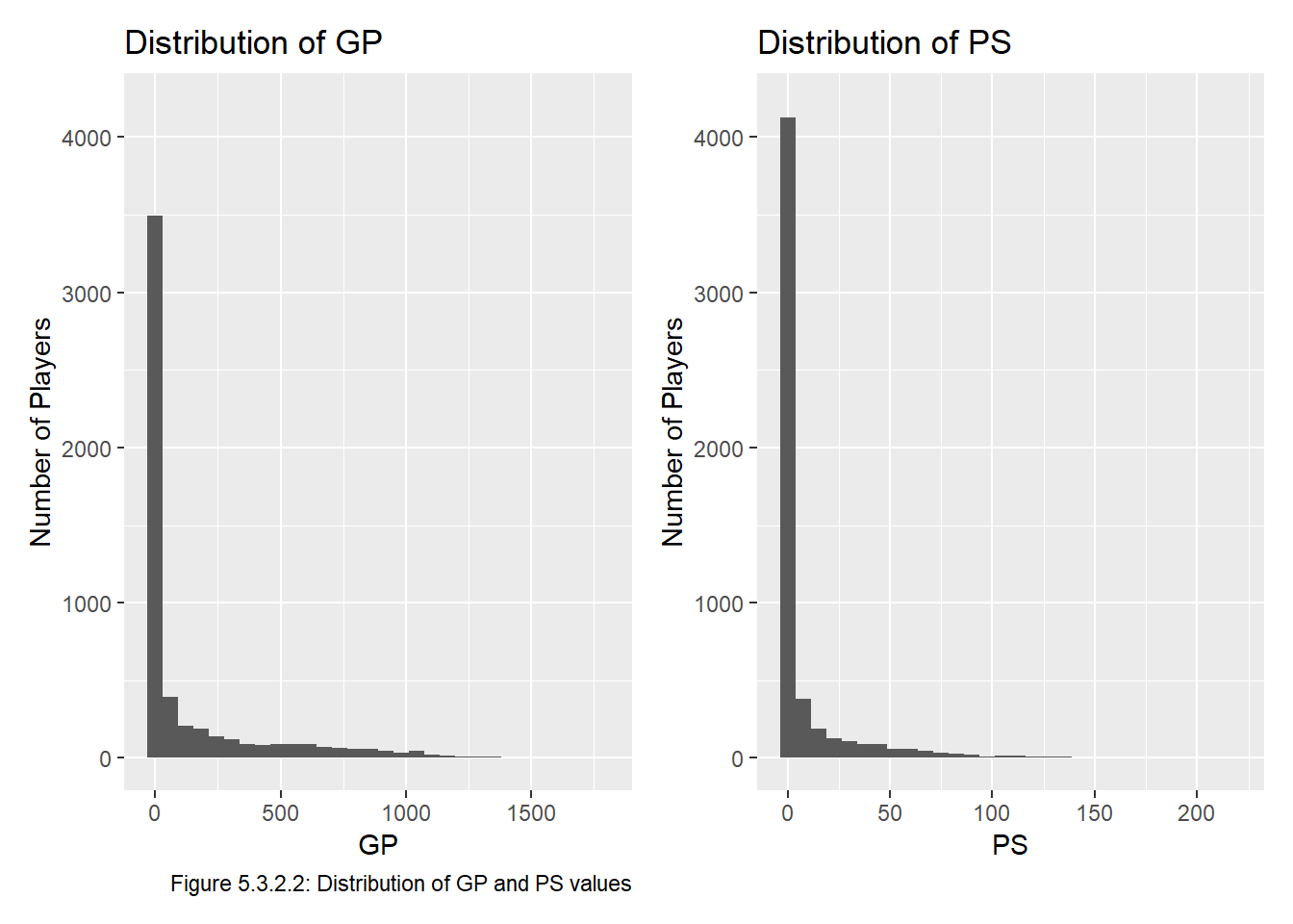
Indeed, both of these are very right-skewed, and clearly a lot of players end up playing a small number of games and are thus not generating able to generate much PS. The fact that there are more players with a small PS than a small GP also makes sense since players could be unproductive in ~75 games, which would take them out of the first bin for GP while they remain in the first bin for PS.
We may also guess that GP and PS are positively correlated, since better players get to play in more games and thus accumulate more PS. Indeed:
cor(all_data$ps, all_data$gp)[1] 0.8558304The relationship is very clear when we split the points by position. Figure 5.3.3.1 is good because it makes comparing points easier, Figure 5.3.3.2 is nice because the plots in it are less crowded.
plot_comb <- ggplot(all_data, aes(x = gp, y = ps, col = pos)) +
  geom_point(alpha = 0.35) +
    labs(title = "Relationship Betweeen PS and GP Depends on Position",
         subtitle = "But the trend generally appears linear",
         x = "GP", y = "PS", colour = "Position",
         caption = "Figure 5.3.3.1: PS as a Function of GP (Coloured by Position)"
         )

plot_facet <-  ggplot(all_data, aes(x = gp, y = ps)) +
  geom_point(alpha = 0.25) +
  facet_wrap(~pos) +
  labs(title = "Relationship Betweeen PS and GP Depends on Position",
         subtitle = "The trend is very linear when separating by positon",
         x = "GP", y = "PS",
       caption = "Figure 5.3.3.2: PS as a Function of GP (Faceted by Position)")

plot_comb / plot_facet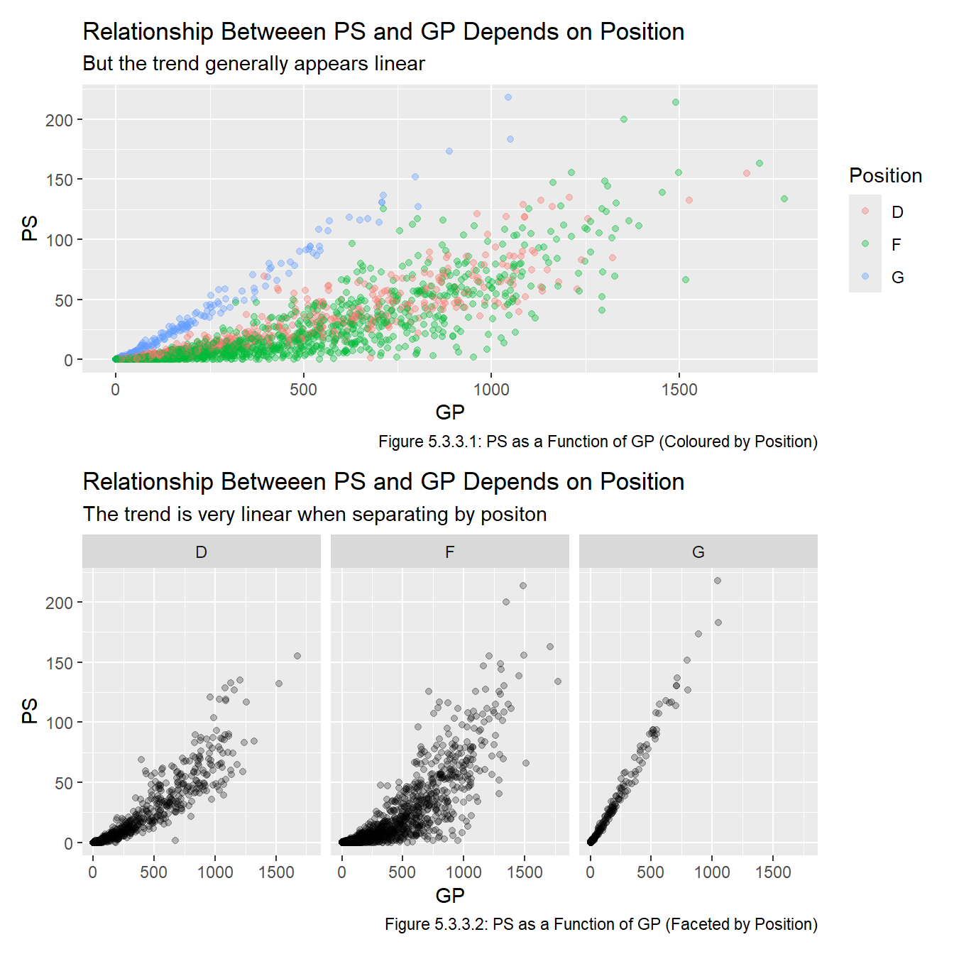
I suspect the strong correlation (especially for goalies) seen in Figure 5.3.1.2 is largely because players who are good and get lots of PS play for longer and thus play in more GP. Because of this, we choose to only include one of GP and PS in each model since PS and GP can be thought to largely measure the same thing (the quality of a player). As mentioned in the Approach section, we will use two GP-related metrics and two PS-related metrics, and fit models to each of them in the Model chapter.
We wish to confirm that players selected earlier in a draft (ie a lower overall) tend to play in more games and generate more PS during their careers than those selected later. (If this was not true then this report will end after this section!) To check this, we start by creating plot of the GP and PS values by overall for a single draft. Note we will use scales = "free" because the scales of GP and PS are quite different:
set.seed(468) # for reproducibility
rand_year <- sample(start_year:end_year, 1) # year is 2015

gp_plot_1 <- all_data |>
  filter(year == rand_year) |>
  ggplot(aes(x = overall, y = gp)) +
  geom_point() +
  labs(x = "Pick Number", y = "GP",
       title = str_glue("GP of Players Drafted in {rand_year}"),
       subtitle = "Note the plots have different scales",
       caption = "Figure 5.3.4.1: GP and PS of a Single Draft")

ps_plot_1 <- all_data |>
  filter(year == rand_year) |>
  ggplot(aes(x = overall, y = ps)) +
  geom_point() +
  labs(x = "Pick Number", y = "PS",
       title = str_glue("PS of Players Drafted in {rand_year}"),
       subtitle = "Note the plots have different scales")

gp_plot_1 + ps_plot_1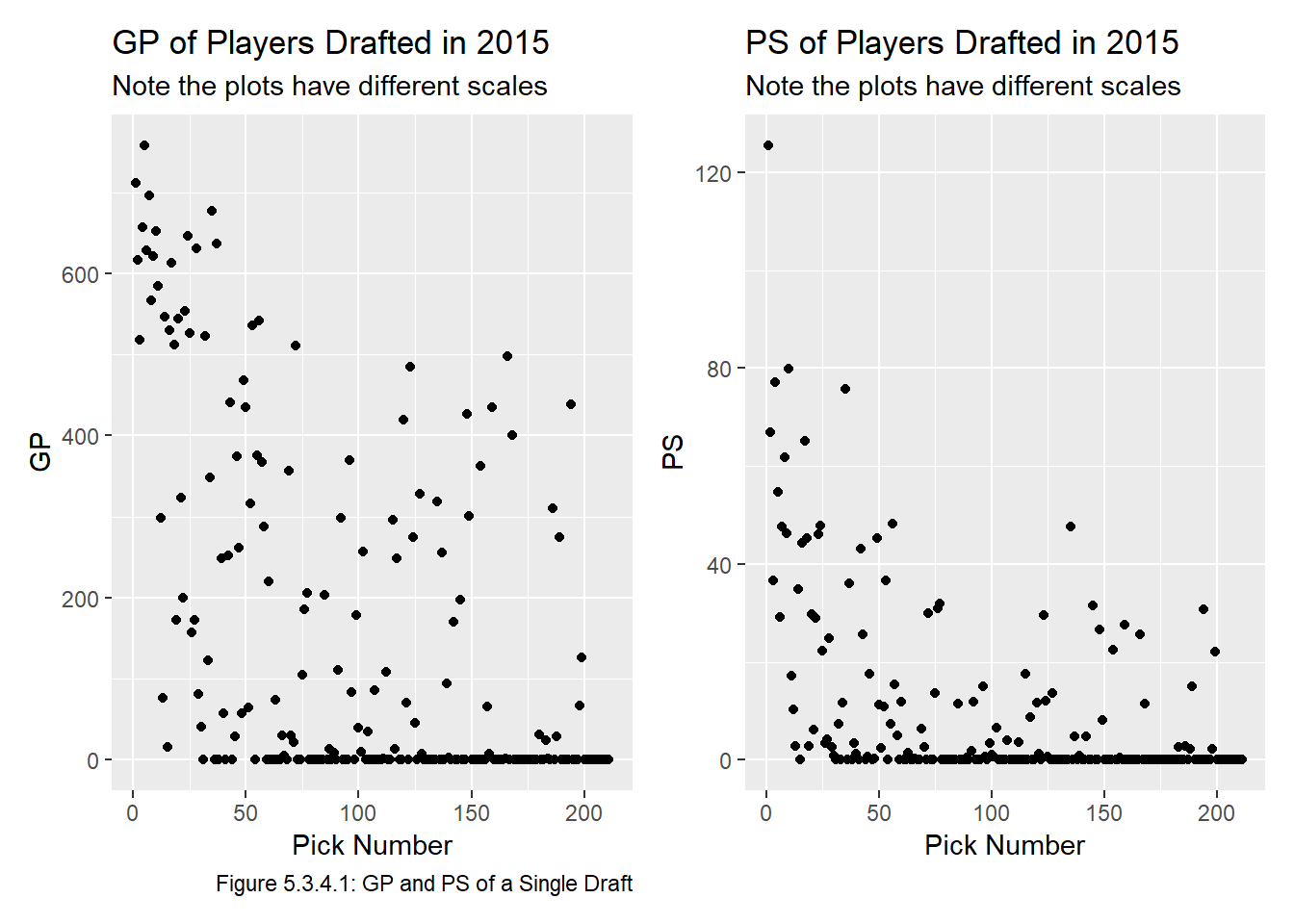
Figure 5.3.4.1 shows that clearly a very significant proportion of players play in 0 games and thus generate 0 PS. With this in mind, we will recreate the plot without the players that played in 0 NHL games to make the plot easier to read. This time we will include all the drafts in our dataset, the result is shown in Figure 5.3.4.2:
gp_plot_2 <- all_data |>
  filter(gp > 0) |>
  ggplot(aes(x = overall, y = gp)) +
  geom_point(alpha = 0.5) +
  labs(title = "Distribution of GP",
       subtitle = "Players with ≥ 1 game only; \nnote the plots have different scales",
       x = "Pick Number", y = "GP",
       caption = "Figure 5.3.4.2: GP and PS with 0s Removed")

ps_plot_2 <- all_data |>
  filter(gp > 0) |>
  ggplot(aes(x = overall, y = ps)) +
  geom_point(alpha = 0.5) +
  labs(title = "Distribution of PS",
       subtitle = "Players with ≥ 1 game only; \nnote the plots have different scales",
       x = "Pick Number", y = "PS")

gp_plot_2 + ps_plot_2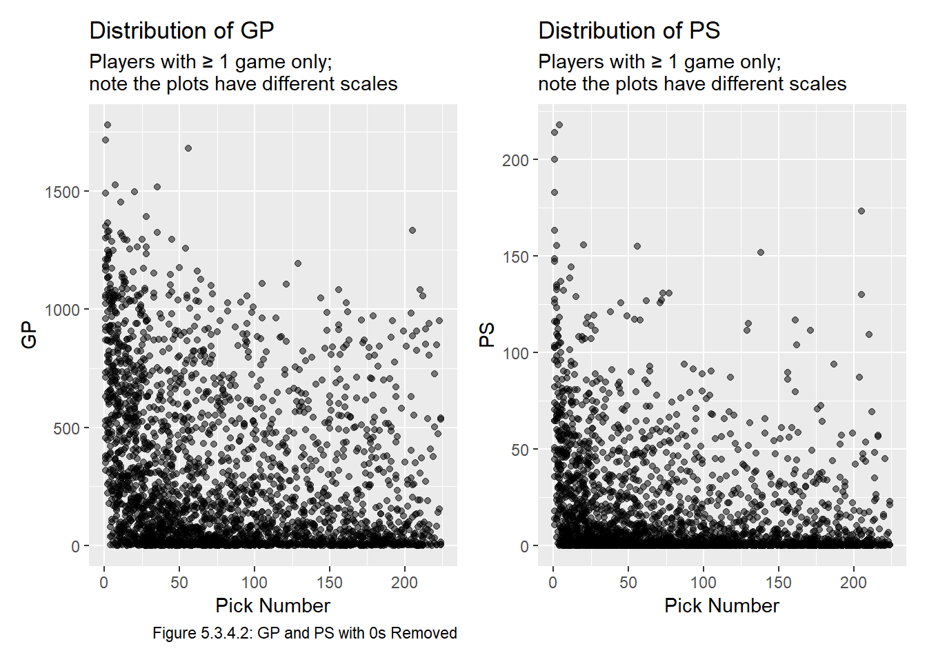
Both plots in Figure 5.3.4.2 are quite dense and difficult to interpret, but there isn’t really any point in jittering the data because it’ll still overlap, so we re plot them in Figure 5.3.4.3 with a random 5 year sample of our dataset.
years <- sample(start_year:end_year, 5) # years are 2018, 1996, 1999, 2010, 2004

gp_plot_3 <- all_data |>
  filter(gp > 0 & year %in% years) |>
  ggplot(aes(x = overall, y = gp)) +
  geom_point(alpha = 0.5) +
  labs(title = "Distribution of GP for 5 Drafts",
       subtitle = "Players with ≥ 1 game only; \nnote the plots have different scales",
       x = "Pick Number", y = "GP",
       caption = "Figure 5.3.4.3: GP and PS of 5 Drafts with 0s Removed")

ps_plot_3 <- all_data |>
  filter(gp > 0 & year %in% years) |>
  ggplot(aes(x = overall, y = ps)) +
  geom_point(alpha = 0.5) +
  labs(title = "Distribution of PS for 5 Drafts",
       subtitle = "Players with ≥ 1 game only; \nnote the plots have different scales",
       x = "Pick Number", y = "PS")

gp_plot_3 + ps_plot_3 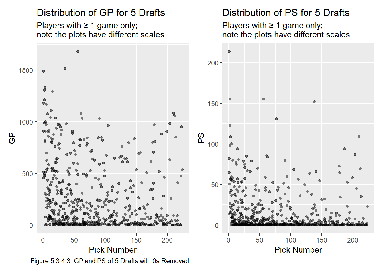
Though the plots in Figure 5.3.4.3 are still quite busy, they show a strange trend that there seems to be more players drafted around 200 overall that end up having successful careers, than drafted around 125. I am not sure of an underlying reason for this, but we will need to be careful when modeling to ensure that these late picks are not given more value than earlier picks.1
The plots in Figure 5.3.4.3 are not great because they are missing the vast majority of our dataset (20 drafts plus all the players who played in 0 NHL games for the 5 years in the sample). To improve this, we plot the mean GP and mean PS of the players selected at each pick in Figure 5.3.4.4. We will use the non-averaged PS and GP values when fitting a model, but the relationship between Overall and PS or GP is much more clear when the values are averaged.
gp_plot_4 <- all_data |>
  group_by(overall) |>
  summarize(mean_gp = mean(gp)) |>
  ggplot(aes(x = overall, y = mean_gp)) +
  geom_point() +
  geom_point(aes(x = 156, y = mean(filter(all_data, overall==156)$gp)), col = "dodgerblue") +
  geom_point(aes(x = 205, y = mean(filter(all_data, overall==205)$gp)), col = "salmon") +
  labs(title = "Mean GP by Pick Number",
       subtitle = "Note the scales are different",
       x = "Pick Number", y = "Mean GP",
       caption = "Figure 5.3.4.3: GP and PS Values Averaged for Each Selection") +
  annotate(geom = "segment", x = 156, y = 450, xend = 156, yend = 220, colour = "dodgerblue",
    arrow = arrow(type = "open", length = unit(0.32, "cm"))) +
  annotate(geom = "label", x = 90, y = 400,
    label = "156th overall selection,\n(mean GP of 203)",
    hjust = "left", colour = "dodgerblue")

ps_plot_4 <- all_data |>
  group_by(overall) |>
  summarize(mean_ps = mean(ps)) |>
  ggplot(aes(x = overall, y = mean_ps)) +
  geom_point() +
  geom_point(aes(x = 156, y = mean(filter(all_data, overall==156)$ps)), col = "dodgerblue") +
  geom_point(aes(x = 205, y = mean(filter(all_data, overall==205)$ps)), col = "salmon") +
  labs(title = "Mean PS by Pick Number",
       subtitle = "Note the scales are different",
       x = "Pick Number", y = "Mean PS") +
  annotate(geom = "segment", x = 175, y = 37.5, xend = 203, yend = 14, colour = "salmon",
    arrow = arrow(type = "open", length = unit(0.32, "cm"))) +
  annotate(geom = "label", x = 100, y = 39,
    label = "205th overall selection,\n(mean PS of 13.124)",
    hjust = "left", colour = "salmon")

gp_plot_4 + ps_plot_4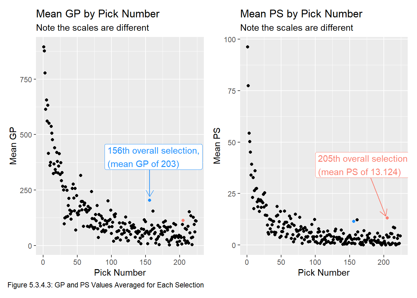
Interestingly, points that appear to stick out in mean GP may not stick out in mean PS (and vise versa). This is indicated by the blue and pink points in each Figure 5.3.4.3. We can also see that in general GP and PS both tend to decrease later in drafts, and that pick value tends to decrease very slowly around pick 75, though there are some picks that stick out (for example, pick 205 has an average PS of 13.124, whereas pick 204 has an average PS of 4.856). This particular outlier is due to Henrik Lundqvist and Joe Pavelski being selected at pick 205 and having career PSs of 173.3 and 130.1, respectively. Very few players drafted this late make it to the NHL (20 of the 25 players in our dataset drafted at pick 205 have more than 0.3 PS), so two players with very successful careers skewing the GP and PS data is not surprising.
We take the following lessons from our EDA into our Transform and Model chapters:
Each model should only use one of GP or PS.
We will need to fit a curve or line to the data, since if we simply set \(v_i\) to be the mean GP or PS of players selected at pick \(i\) then we will fail the first requirement of a feasible model (as defined in the Question chapter), that \(v_i > v_{i+k}\) for all \(i, k \in \mathbb Z^+\).
The GP by pick number and PS by pick number metrics are two of the metrics we will use in the Model chapter.
I initially tried to estimate pick value using a \(k\)-nearest neighbours algorithm, but it valued picks around pick 200 more than picks around 125 overall.↩︎