We install and load the necessary packages, along with functions and data from prior chapters.
Code
# renv::install("tidyverse")# renv::install("dplyr")# renv::install("gt")# renv::install("reactable")# renv::install("patchwork")# renv::install("stringr")library(tidyverse)library(dplyr)library(gt)library(reactable)library(patchwork)library(stringr)source("functions.R") # load functions defined in prior chapters
6.2 Introduction
The first two metrics we will fit models to are GP and PS, in the Transform chapter, we will create the other two metrics which we will base our model off of.
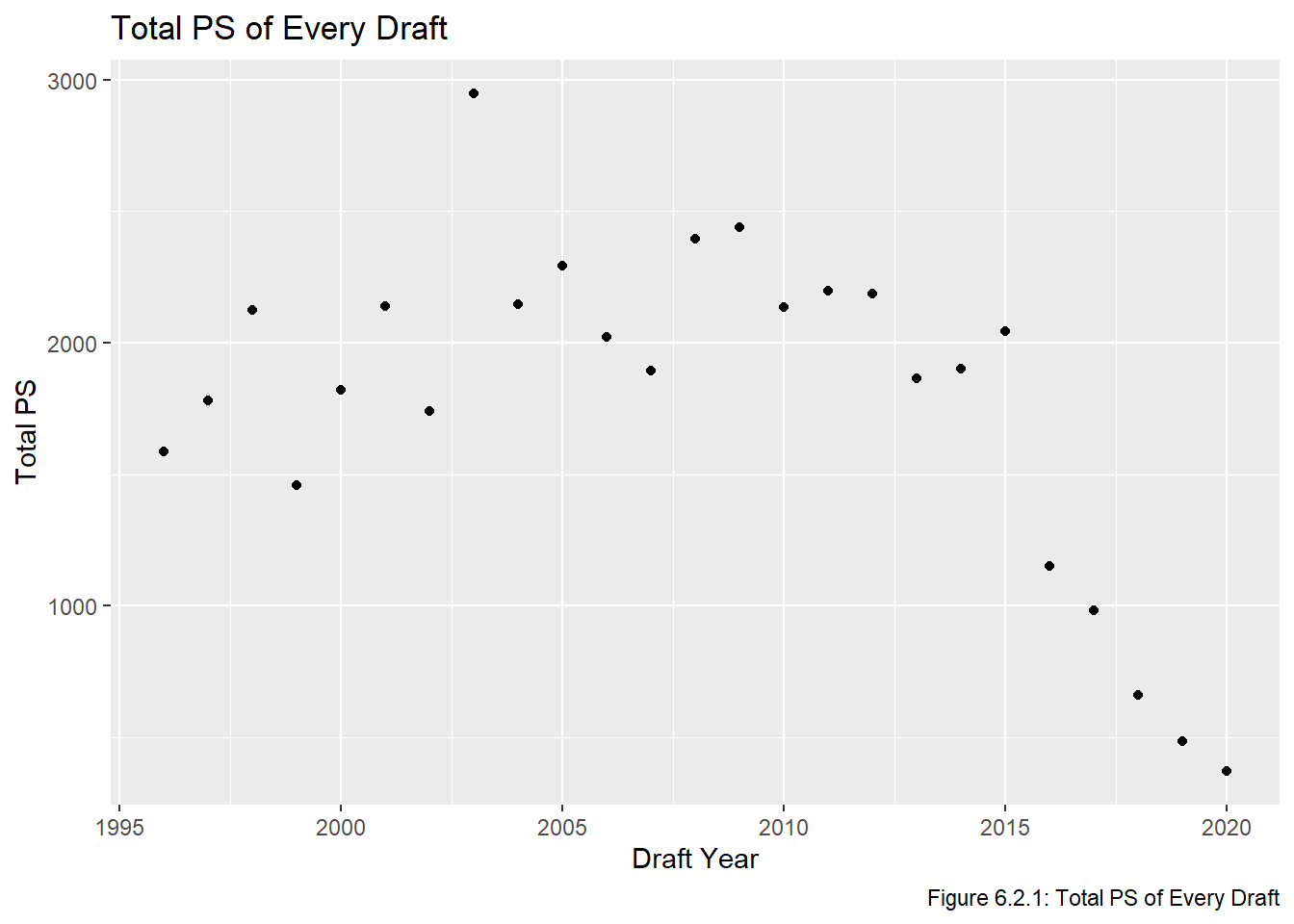
The first transformation we will make in this chapter is to adjust our PS to better represent the careers of active players (ie those who have not retired yet). Recall that in the Visualize chapter we looked at the average PS of all players in out dataset drafted at pick \(i\). As mentioned in the constraints section, one problem with this approach is that players drafted more recently will have had fewer years to generate PS. Figure 6.2.1 shows that, unsurprisingly, the total PS is quite a bit lower for the drafts between 2016 and 2020:
Code
all_data |>group_by(year) |>summarize(total_ps =sum(ps)) |>ggplot(aes(x = year, y = total_ps)) +geom_point() +labs(title ="Total PS of Every Draft", x ="Draft Year", y ="Total PS", caption ="Figure 6.2.1: Total PS of Every Draft")
Considering this, it makes sense to make an adjustment to active players based on an estimate of the PS they will generate in the remainder of their career.
The other transformation we make in this chapter is to implement the method taken by Luo (2024) which is to define a draft pick to be a “success” if that prospect becomes an NHL regular, which is defined to be playing in \(\ge\) 200 NHL games for skaters. We will then fit a logistic regression model to estimate the probability of a player selected with pick \(i\) becoming a regular NHL player. Note that Luo (2024) using this definition for different analysis (he was evaluating prospect quality to better evaluate prospects, not value draft picks), but the applications are close enough and so we should be able to use his definition without any issues.
6.3 Transforming PS
6.3.1 Introduction
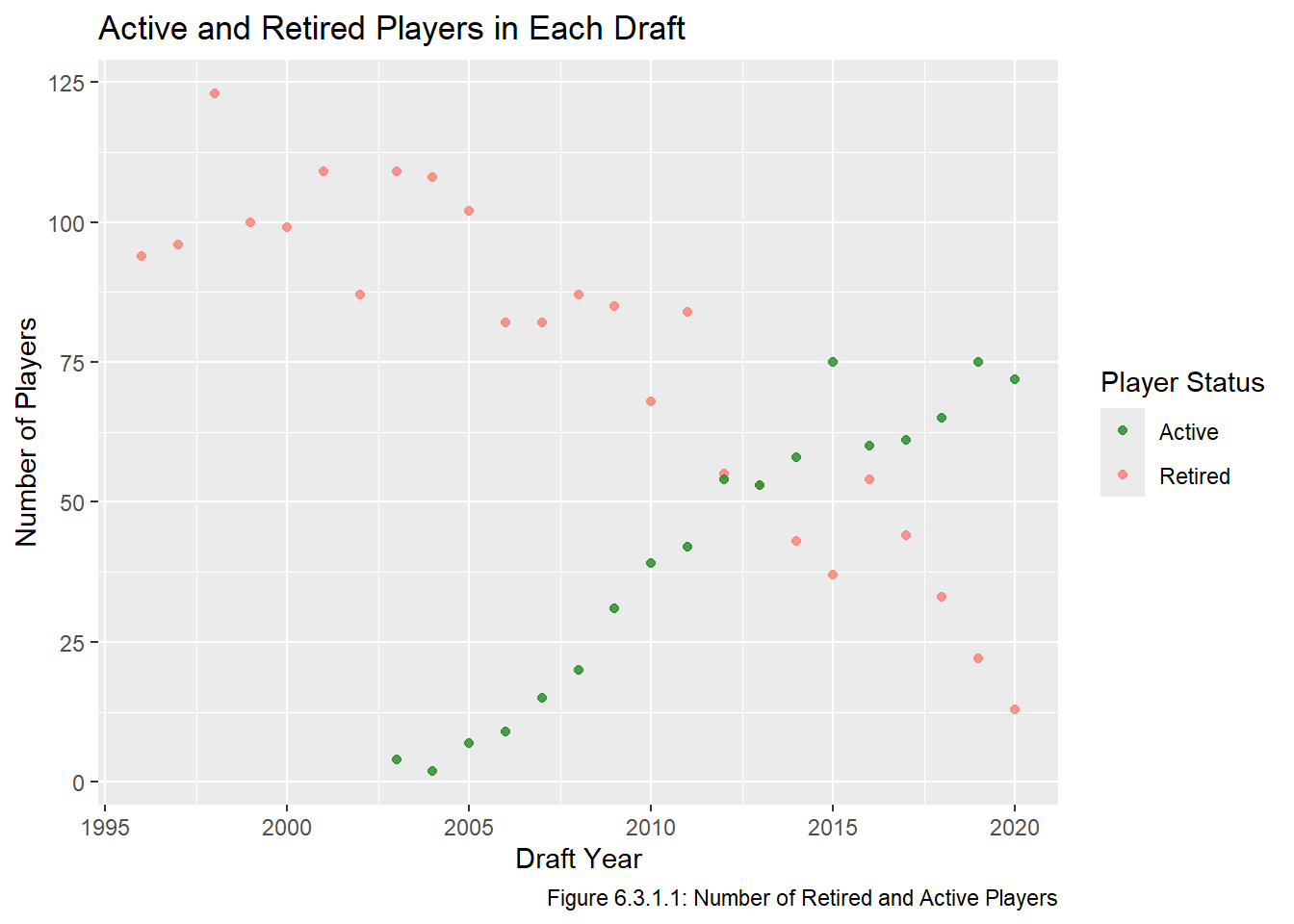
A similar issue to the one raised above is that there are quite a few players in our dataset who can still generate additional PS because they haven’t retired. These two issues are related as it is probably reasonable to expect that the discrepancy between the 2016-2020 PS totals and the other years is at least partially due to there being so many active players who were drafted in that time frame. Indeed, we can see in Figure 6.3.1.1 that there are still a large number of active players from around the 2010 draft onward.
Code
active_players <- all_data |>filter(to ==2025) |># recall to == 2025 if the player is still activegroup_by(year) |>summarize(players =n()) |>mutate(type ="Active")retired_players <- all_data |>filter(to <2025& to != year) |># inactive players who played in the NHLgroup_by(year) |>summarize(players =n()) |>mutate(type ="Retired")num_nhl_players <-rbind(retired_players, active_players)ggplot(num_nhl_players, aes(x = year, y = players, col = type)) +scale_color_manual(values =c("Active"="forestgreen", "Retired"="salmon")) +geom_point(alpha =0.8) +labs(title ="Active and Retired Players in Each Draft", x ="Draft Year", y ="Number of Players", caption ="Figure 6.3.1.1: Number of Retired and Active Players", col ="Player Status")
We can see that our dataset has quite a few active players, and the full value of these players’ careers cannot be fully known. As an aside, it is interesting that PS is so high for the drafts between 2010 and 2015 even though there are still so many active players from those drafts. The 2015 draft is widely considered to be on of the best drafts ever, which explains why it does not follow the general decreasing trend after 2014, but this does not explain why the other drafts were so high. I guess it is possible the drafts between 2010 and 2014 were also really strong drafts, but it seems odd that there would be 6 strong drafts in a row. I did a little bit of research but couldn’t find anything about it. It certainly appears that players drafted in more recent draft classes tend to produce less PS, which will give them less weight when we fit out regression models. We have three options
Only include drafts from before 2003 (there are no active NHL players who were drafted in 2002 or earlier).
Ignore this issue altogether (as if every active player in our dataset retired right now).
Make some sort of adjustment to the PS values of active players to account for the remainder of their career.
Neither of the first two options are particularly appealing. The first is unideal because of sample size concerns and the changes that have taken place in terms of draft eligibility and strategy since the 1980s (which we would need to include to maintain a sample size of 25). The second option is also not great because it will severely underestimate the quality of star players drafted in the last few years (elite players can play for 15-20 seasons, so we could be missing three quarters of a player’s career if he was drafted in 2020). Thus we will attempt to estimate the remaining value of a player’s career.
Estimating the remaining value of a player’s career could be an entire project all on its own, so we will not go too into too much detail here. That being said, the adjustment we are about to make should reduce the amount that our model underestimates players who were drafted recently (while acknowledging that we will not completely fix it). Let \(gp_{i,j}\) and \(ps_{i,j}\) be the GP and PS of the player drafted at pick \(i\) of draft \(j\). If the player is retired, then no adjustment is required, so we set \(ps_{i,j}^{adj} = ps_{i,j}\). If that player is active, we will set \(ps^{adj}_{i,j} = ps_{i,j} + \frac{ps_{i,j}}{gp_{i,j}} \times \hat gr_{i,j}\), where \(\hat gr_{i,j}\) is our estimate of the number of games left in the career the player. We will set \(\hat gr_{i,j} = \frac{gp_{i,j}}{years_{j}} \cdot \hat yr_j\), where \(years_{j}\) is the number of years since players from draft \(j\) were drafted and \(\hat yr_j\) is the estimated number of years left in the career of all players drafted in year \(j\). In other words, the estimated number of games remaining in a player’s career is their average number of games per season times the estimated number of years remaining. Simplifying, we have \(ps_{i,j}^{adj} = ps_{i,j} + \frac{ps_{i,j}}{years_{j}} \cdot\hat{yr_{j}}\). We will estimate \(yr_j\) using data from 1996-2004 since almost all the players drafted between these years are retired. When we code this adjustment later in this chapter, we will verify that the PS values of drafts with a large number of active players end up looking similar to drafts where everyone is retired.
6.3.2 Estimating Remaining Career Length
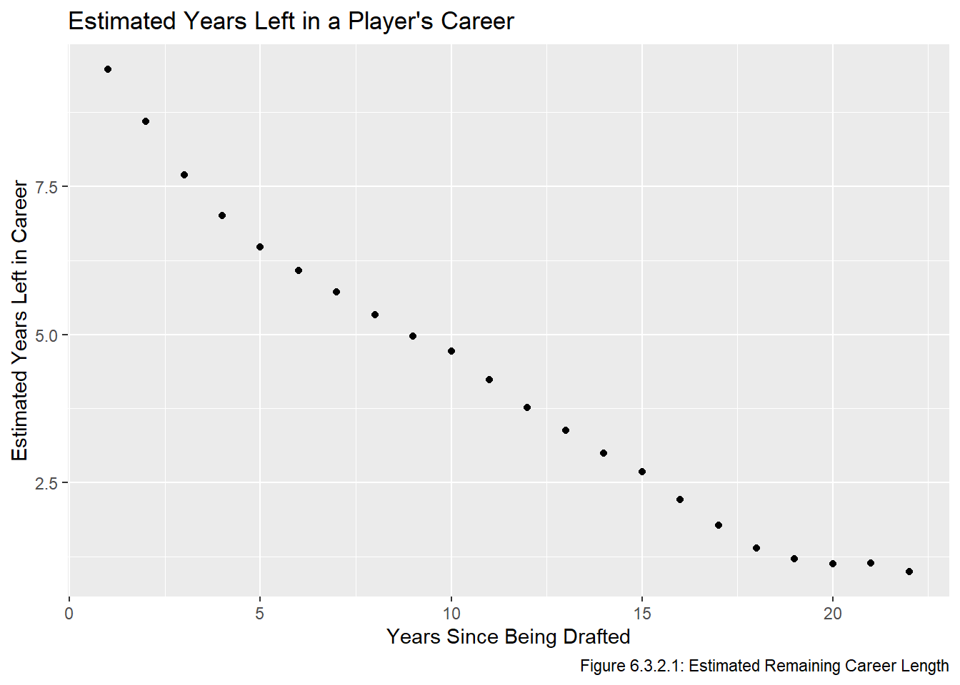
Let \(yr_j\) be the number of years players drafted in draft \(j\) have remaining in their career, given they were drafted \(k\) years ago. We aim to estimate this value, and will do so by setting \(\hat yr_j\) to be the mean career length of players were drafted between 1996 and 2004 AND played in at least \(k\) seasons. We calculate it for \(1 \le k \le 22\) to make the indexing more intuitive, even though we will only be using the values \(k \ge 5\), since no active player drafted in 2020 or earlier can have played for less than 4 seasons. We calculate \(\hat yr_j\) and then present it in graphical form (Figure 6.3.2.1) and in table form (Table 6.3.2.2).
Code
get_length <-Vectorize(function(len){ all_data |>mutate(rem_career_len = to - year - len) |>filter(year %in%1996:2004& rem_career_len >=0) |>summarize(mean =mean(rem_career_len)) |>pull(mean)})est_yr <-data.frame(k =seq(1,22)) |>mutate(yr =get_length(k)) ggplot(est_yr, aes(x = k, y = yr)) +geom_point() +labs(title ="Estimated Years Left in a Player's Career", x ="Years Since Being Drafted", y ="Estimated Years Left in Career", caption ="Figure 6.3.2.1: Estimated Remaining Career Length")
Code
est_yr |>gt() |>opt_all_caps() |>cols_label(k ="Years Since Being Drafted", yr ="Estimated Years Remaining in Career") |>tab_source_note("Table 6.3.2.2: Estimated Remaining Career Length")
Years Since Being Drafted
Estimated Years Remaining in Career
1
9.477981
2
8.601741
3
7.696370
4
7.004577
5
6.474969
6
6.080107
7
5.716814
8
5.333333
9
4.967093
10
4.720000
11
4.238318
12
3.761155
13
3.382263
14
2.992780
15
2.684444
16
2.212766
17
1.773333
18
1.396396
19
1.214286
20
1.125000
21
1.142857
22
1.000000
Table 6.3.2.2: Estimated Remaining Career Length
The correct interpretation of these estimates is that a current NHL player who was drafted 1 year ago has an estimated 9.478 years left in their career, a current NHL player who was drafted 5 years ago has an estimated 6.475 years left in their career, and on.
6.3.3 Adjusting PS Values
Now that we have estimated the remaining number of years for each active NHL player, we can estimate the total PS for their career. Recall that in the introduction of this chapter we said \(ps_{i,j}^{adj} = ps_{i,j} + \frac{ps_{i,j}}{years_{j}} \cdot\hat{yr_{i,j}}\). We make this adjustment and then produce Table 6.3.3.1, which has the PS and adjusted PS values
Code
active_players <- all_data |># we need to make an adjustment for active playersfilter(to ==2025) |>mutate(career_len = to - year) |>mutate(adj_ps = ps +round(ps / career_len *get_length(career_len), 2)) |>select(-career_len)inactive_players <- all_data |># no adjustment needed for retired playersfilter(to !=2025) |>mutate(adj_ps = ps)all_data_adj <-rbind(active_players, inactive_players)all_data_adj |>reactable(defaultPageSize =25,columns =list(year =colDef(name ="Year"),overall =colDef(name ="Overall"),to =colDef(name ="To"),pos =colDef(name ="Pos"),gp =colDef(name ="GP"),ps =colDef(name ="PS"),adj_ps =colDef(name ="Adjusted PS") ))
Table 6.3.3.1: Data with Adjusted PS values
Note that the adjusted PS values for players who are expected to retire soon may not have changed much, if at all. To say it again, this estimate is not perfect, but it is better than the alternatives (using older data or ignoring the issue). In particular, this method assumes all players will continue to generate PS and play in games at the same rate as they have to this point in their career, and that the number of additional years a player will play for only depends on how many years ago they were drafted.
6.3.4 Evaluating our Adjustment
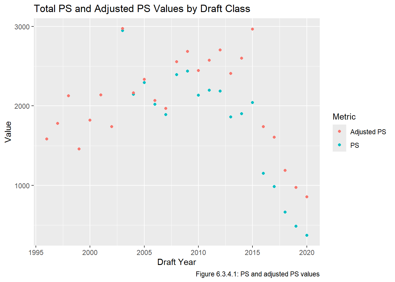
We can do some checks to see if these estimates seem reasonable. First, we look at a plot of the PS values before and after the adjustment. We will plot all years for sake of comparison, but recall we only made changes for active players, and thus the drafts between 1996 and 2002 were completely unaffected (and thus the PS and adjusted PS points are on top of each other):
Code
all_data_adj |>group_by(year) |>summarize("PS"=sum(ps), "Adjusted PS"=sum(adj_ps)) |>pivot_longer(cols =ends_with("PS"), names_to ="metric", values_to ="value") |>ggplot(aes(x = year, y = value, col = metric)) +geom_point() +labs(y ="Value", x ="Draft Year", title ="Total PS and Adjusted PS Values by Draft Class", caption ="Figure 6.3.4.1: PS and adjusted PS values", col ="Metric")
It seems our adjustment was worthwhile since we can see in Figure 6.3.4.1 that the drafts after 2010 (which are the drafts with a large number of active players) saw their PS values go up substantially.
Next, we check the magnitude of our changes by calculating the mean and standard deviation of \(p_{i,j}\) for \(j \in \{ 1996, ..., 2004\}\), \(p_{i,j}\) for \(j \in \{ 2012, ..., 2020 \}\), and \(p_{i,j}^{adj}\) for \(j \in \{ 2012, ..., 2020\}\). Note that the intervals are the same size and that the first interval is years where almost all players have retired, and the second interval contains years which had their PS values were more heavily adjusted.
Code
mean_sd <-function(data){c(mean(data), sd(data)) }mean_sd(filter(all_data_adj, year <=2004)$ps)
[1] 8.806005 23.570904
Code
mean_sd(filter(all_data_adj, year >=2012)$ps)
[1] 6.067517 14.869298
Code
mean_sd(filter(all_data_adj, year >=2012)$adj_ps)
[1] 8.873139 21.217618
Our adjustment looks quite good since the mean and standard deviation of the first and third sets seem close, indicating the adjusted PS values for drafts we adjusted “look like” the true PS values. Additionally, the first and second sets look quite different, suggesting that the adjustment we made was necessary.
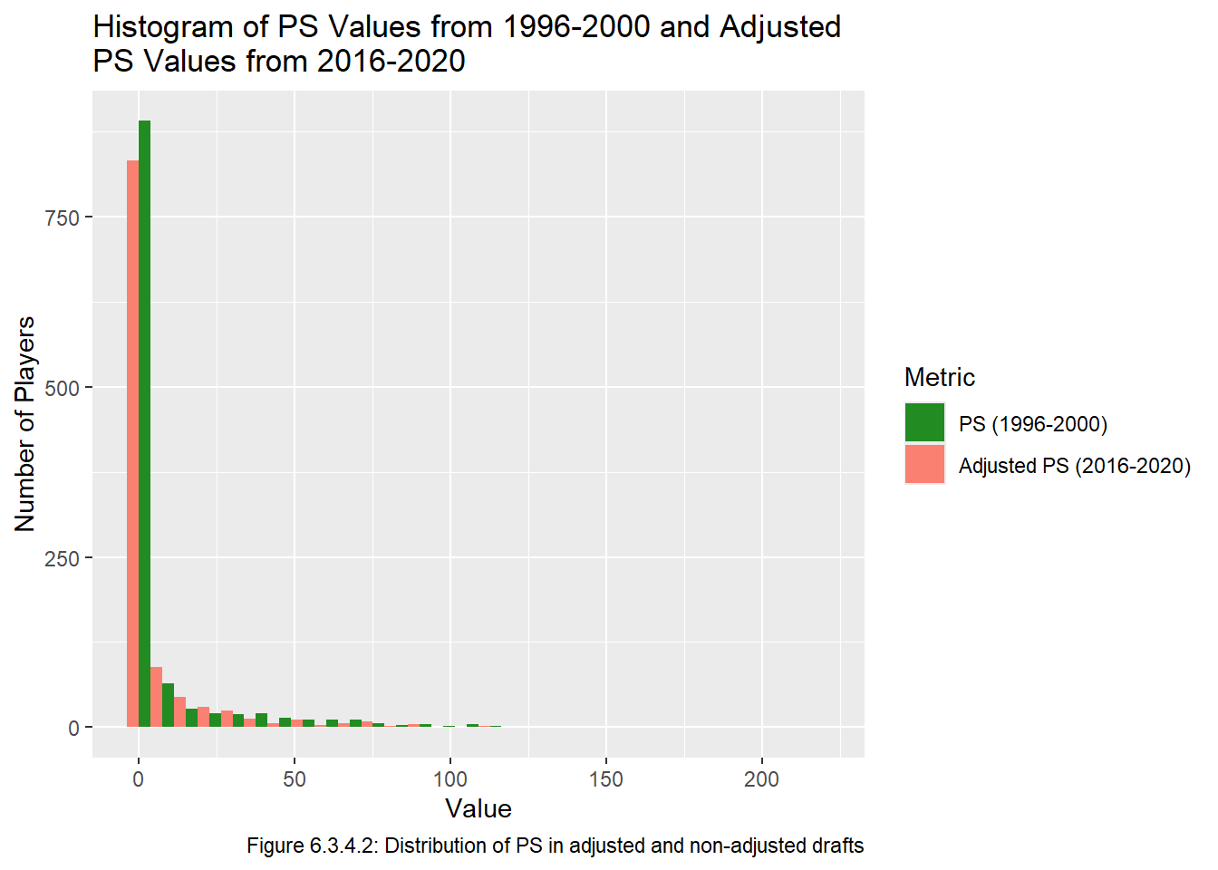
Another way we can check if the adjusted drafts seem similar to the drafts which required little adjustment is by comparing a histogram of the drafts between 1996 and 200 with the drafts between 2016 and 2020. Of course, we’re not expecting them to be perfectly identical because there is a fair amount of variation even between drafts that required little to no adjustment (for example 1999 and 2003 are quite different in Figure 6.2.1).
Code
all_data_adj |>pivot_longer(cols =c(ps,adj_ps), names_to ="metric", values_to ="value") |>filter((year %in%1996:2000& metric =="ps") | (year %in%2016:2020& metric =="adj_ps")) |>ggplot(aes(x = value, fill = metric)) +geom_histogram(position ="dodge") +labs(x ="Value", y ="Number of Players", col ="Metric", title ="Histogram of PS Values from 1996-2000 and Adjusted\nPS Values from 2016-2020", caption ="Figure 6.3.4.2: Distribution of PS in adjusted and non-adjusted drafts", fill ="Metric") +scale_fill_manual(breaks =c("ps", "adj_ps"), labels =c("PS (1996-2000)", "Adjusted PS (2016-2020)"),values =c("ps"="forestgreen", "adj_ps"="salmon") )
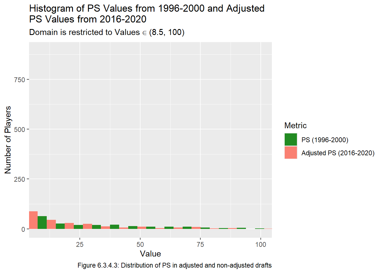
The values in Figure 6.3.4.2 are a bit hard to compare because the tail gets so small so fast, but the values close to 0 look similar enough. We can zoom in on the tail, note that there isn’t much to look at after 100:
Code
all_data_adj |>pivot_longer(cols =c(ps,adj_ps), names_to ="metric", values_to ="value") |>filter((year %in%1996:2000& metric =="ps") | (year %in%2016:2020& metric =="adj_ps")) |>ggplot(aes(x = value, fill = metric)) +geom_histogram(position ="dodge") +labs(x ="Value", y ="Number of Players", col ="Metric", title ="Histogram of PS Values from 1996-2000 and Adjusted\nPS Values from 2016-2020", subtitle =quote(paste("Domain is restricted to Values"%in%"(8.5, 100)")),caption ="Figure 6.3.4.3: Distribution of PS in adjusted and non-adjusted drafts", fill ="Metric") +scale_fill_manual(breaks =c("ps", "adj_ps"), labels =c("PS (1996-2000)", "Adjusted PS (2016-2020)"),values =c("ps"="forestgreen", "adj_ps"="salmon") ) +coord_cartesian(xlim =c(8.5, 100))
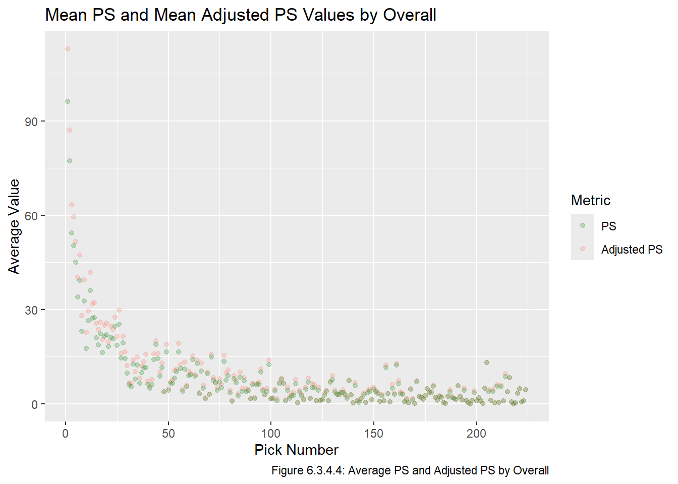
There seem to be a similar number of observations in each bin, so it seems like our estimations are reasonable. Note again that we are clear restrictions and potential sources of error with this approach, and in the Model chapter we will fit a model using both the raw PS values and the adjusted PS values. Before moving on to the next section of this chapter, we create a plot of the mean PS and adjusted PS values, which is the same as the last plot from the Visualize chapter, except we will be including the adjusted PS values. This plot is given below in Figure 6.3.4.4.
Code
all_data_adj |>pivot_longer(cols =c(ps, adj_ps), names_to ="metric", values_to ="value") |>group_by(metric, overall) |>summarize(mean_val =mean(value)) |>ggplot(aes(x = overall, y = mean_val, col = metric)) +geom_point(alpha =0.25) +labs(x ="Pick Number", y ="Average Value", col ="Metric", title ="Mean PS and Mean Adjusted PS Values by Overall", caption ="Figure 6.3.4.4: Average PS and Adjusted PS by Overall", fill ="Metric") +scale_colour_manual(breaks =c("ps", "adj_ps"), labels =c("PS", "Adjusted PS"),values =c("ps"="forestgreen", "adj_ps"="salmon") )
As we can see in Figure 6.3.4.4, the mean Adjusted PS values are all are greater than or equal to the mean unadjusted PS values, which is to be expected what we would expect because \(ps^{adj}_{i,j} \ge ps_{i,j}\), we add PS to players who are still active NHL players and do not change the PS values of retired players. Adjusted PS is the third of the four metrics we will use in the Model chapter, though note that we we will use the raw adjusted PS values rather than the aggregated values.
6.4 Transforming GP
6.4.1 Introduction
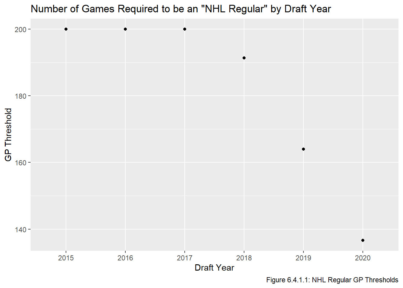
In this section we will add a column our dataset indicating whether the player became or is on track to become an NHL regular. We will adopt the same definition as Luo (2024), which is that a player is an NHL regular if they are a skater who played in, or is on track to play in, 200 NHL games. This is straightforward a player is retired or has already played in enough games, but is more complex if the player is active and has not yet reached the required number of games. For these players, we will take an almost identical approach as Luo (2024), which changes the GP threshold depending on when a player was drafted. The modified threshold for skaters is given below, where \(j\) is the year the player was drafted in, and \(t_j\) is the threshold for players drafted in year \(j\).
\[t_j = \begin{cases}200 \text{, if $j \le 2017$}\\ \frac{82\times(2025-j)}{3} \text{, if $j \in \{ 2018, 2019, 2020 \}$}\\ \end{cases}\]
Luo did not consider goalies at all in his paper, so one of the changes we will make from Luo’s equation is that the threshold for goalies will be \(\frac{t_j}{2}\) because goalies take longer to develop and even the best goalies only play in at most 75% of their teams’ games. Thus 100 games for a goalie is around 2.5 seasons’ worth, which is roughly equivalent to 200 games for a skater.
Code
get_threshold <-function(year){ ifelse(year <=2017, 200, 82/3*(2025-year)) } thresholds <-data.frame(year =seq(2015,2020)) |>mutate(t =get_threshold(year)) ggplot(thresholds, aes(x = year, y = t)) +geom_point() +scale_x_discrete(limits =seq(2015, 2020)) +labs(x ="Draft Year", y ="GP Threshold", title ='Number of Games Required to be an "NHL Regular" by Draft Year', caption ="Figure 6.4.1.1: NHL Regular GP Thresholds")
Code
thresholds |>gt() |>opt_all_caps() |>cols_label(year ="Draft Year", t ="GP Threshold") |>tab_source_note("Table 6.4.1.2: NHL Regular GP Thresholds")
Draft Year
GP Threshold
2015
200.0000
2016
200.0000
2017
200.0000
2018
191.3333
2019
164.0000
2020
136.6667
Table 6.4.1.2: NHL Regular GP Thresholds
Figure 6.4.2.1 includes a plot of the skater GP thresholds based on the skater’s draft year. This information is also presented in table form in Table 6.4.2.2. Note that we don’t care what the threshold is for player’s drafted after 2020 because those players are not in our dataset. The only other difference between our threshold is Luo’s is that the years are different, since Luo’s work is from a year ago and used data from slightly different years. Note that Luo did some checks to make sure this estimate is appropriate, it turned out to be quite a good predictor of whether a player will play in 200 games.
6.4.2 Adding the Indicator
We make the indicator as a new column, first for retired players, then for active players, and then use rbind ro combine them.
Code
all_data_ret <- all_data_adj |># thresholds for retired playersfilter(to !=2025) |>mutate(thresh =ifelse(pos =="G", 100, 200), reg = gp >= thresh) |>select(-thresh) all_data_act <- all_data_adj |># hresholds for active playersfilter(to ==2025) |>mutate(thresh =ifelse(pos =="G", get_threshold(year) /2,get_threshold(year)),reg = gp >= thresh) |>select(-thresh) all_data_adj <-rbind(all_data_ret, all_data_act)
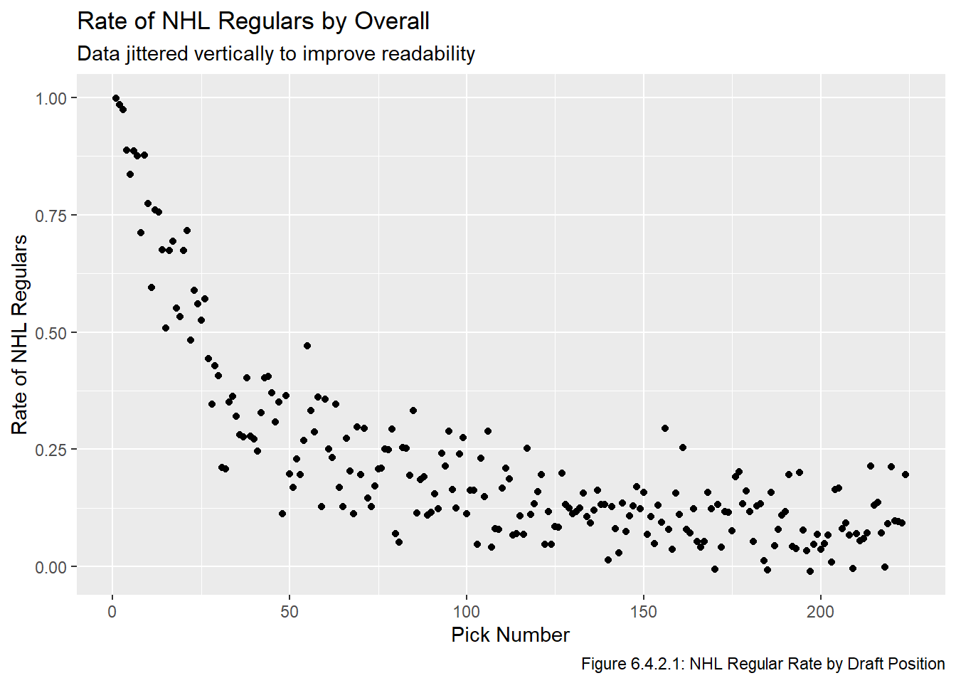
We have now added the column necessary to create a model based on whether an NHL player became an NHL regular. We won’t use the aggregated values to fit a model, but to see if this metric has potential we aggregate the data to get the average rate at which every pick becomes an NHL regular and then plot it to ensure the rate generally decreases ad the draft goes on. We also jitter the data vertically to make the plot more readable.
Code
all_data_adj |>group_by(overall) |>summarize(rate =mean(reg)) |>ggplot(aes(x = overall, y = rate)) +geom_point(position =position_jitter(width =0, height =0.015)) +labs(x ="Pick Number", y ="Rate of NHL Regulars", title ="Rate of NHL Regulars by Overall", subtitle ="Data jittered vertically to improve readability", caption ="Figure 6.4.2.1: NHL Regular Rate by Draft Position")
Figure 6.4.2.1 has a similar shape to the plots at the end of the Visualize chapter. We will use the raw TRUE/FALSE values to fit a logistic regression model in the Model chapter.
6.5 Combining Everything
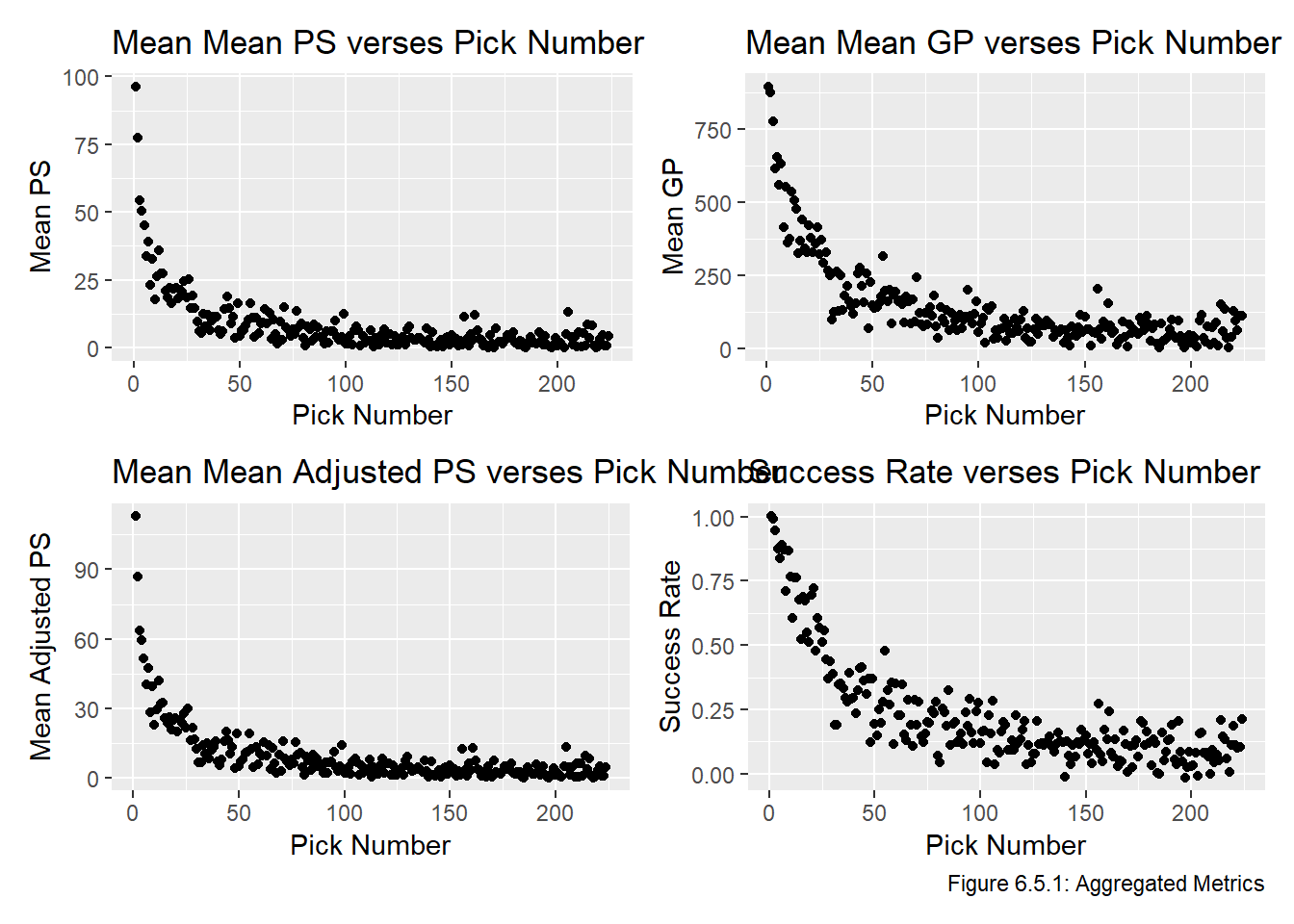
Now that we have the metrics we will use in the Model chapter, we will combine them into a single data frame to make the modelling as straightforward as possible. We also make a plot of the average values by pick each metric in Figure 6.5.1, note that no points can be directly on top of each other because all points have different overall values, but the plot of sis once again jittered vertically. We would probably prefer to plot these curves on the same plot, but their scales are completely different so this would be meaningless. Note that the following two Stack Overflow posts were particularly helpful when writing this code:
The plots in Figure 6.5.1 all have the same general shape, though some of them are on different scales. In the Model chapter, we will fit a model to the raw data, put the models on the same scale, and evaluate the models.
6.6 Storing the Transformations
As touched on at the very end of the Tidy chapter, we will be storing our data frames in an S3 bucket. We use the same code to add all_data_adj and all_data_comb to our S3 bucket within AWS. In function.R we get these data frames by querying the S3 bucket using duckdb.
Code
Sys.setenv("AWS_ACCESS_KEY_ID"=Sys.getenv("AWS_ACCESS_KEY_ID"),"AWS_SECRET_ACCESS_KEY"=Sys.getenv("AWS_SECRET_ACCESS_KEY"), "AWS_DEFAULT_REGION"="us-east-2")bucket ="trevor-stat468"s3write_using(all_data_adj, FUN = write_parquet, bucket = bucket, object ="all_data_adj.parquet")s3write_using(all_data_comb, FUN = write_parquet, bucket = bucket, object ="all_data_comb.parquet")
Luo, Hubert. 2024. “Improving NHL Draft Outcome Predictions Using Scouting Reports.”Journal of Quantitative Analysis in Sports 20 (4): 331–49. https://doi.org/10.1515/jqas-2024-0047.