We install and load the necessary packages, along with functions and data from prior chapters.
Code
# renv::install("patchwork")# renv::install("stringr")# renv::install("reactable")# renv::install("pins")# renv::install("vetiver")# renv::install("plumber")# renv::install("aws.s3")library(patchwork)library(stringr)library(reactable)library(pins)library(vetiver)library(plumber)library(aws.s3)source("functions.R") # load functions defined in prior chapters
7.2 Introduction/Recap
Now that we have metrics representing different ways of calculating the historical value of a draft pick, we can now develop models for predicting the value of future picks. First, we will fit a linear regression model to the data, then we will fit a logistic model for the indicator representing whether a player became an NHL regular, and then we will develop a model via non-linear regression. We will then put the models on the same scale by multiplying each predicted value by a constant, allowing us to compare models more effectively. Note that the following two Stack Overflow posts were once again very helpful when writing the code in this chapter:
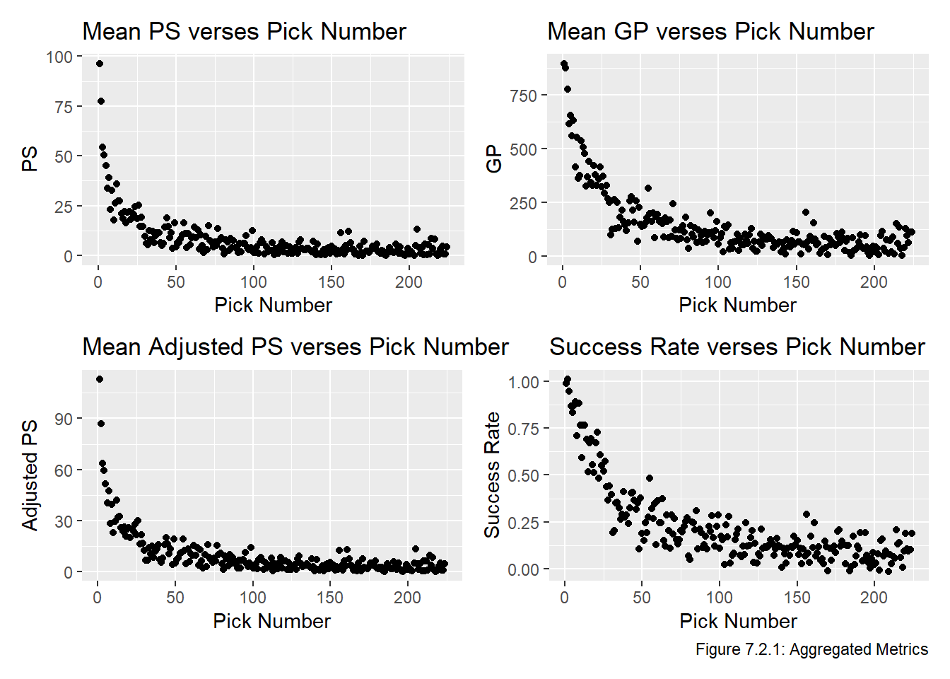
Recall the four plots we ended the Transform chapter with this plot, based on the PS, GP, adjusted PS, and success rate, for every selection between 1 and 224. For convenience we replot this data below in Figure 7.2.1:
Table 7.3.1: Predicted Values from Linear Regression Models
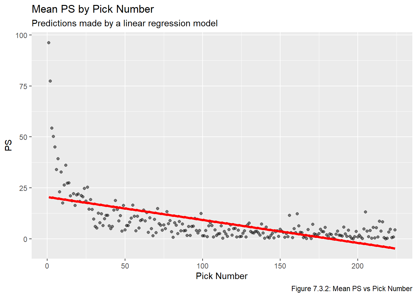
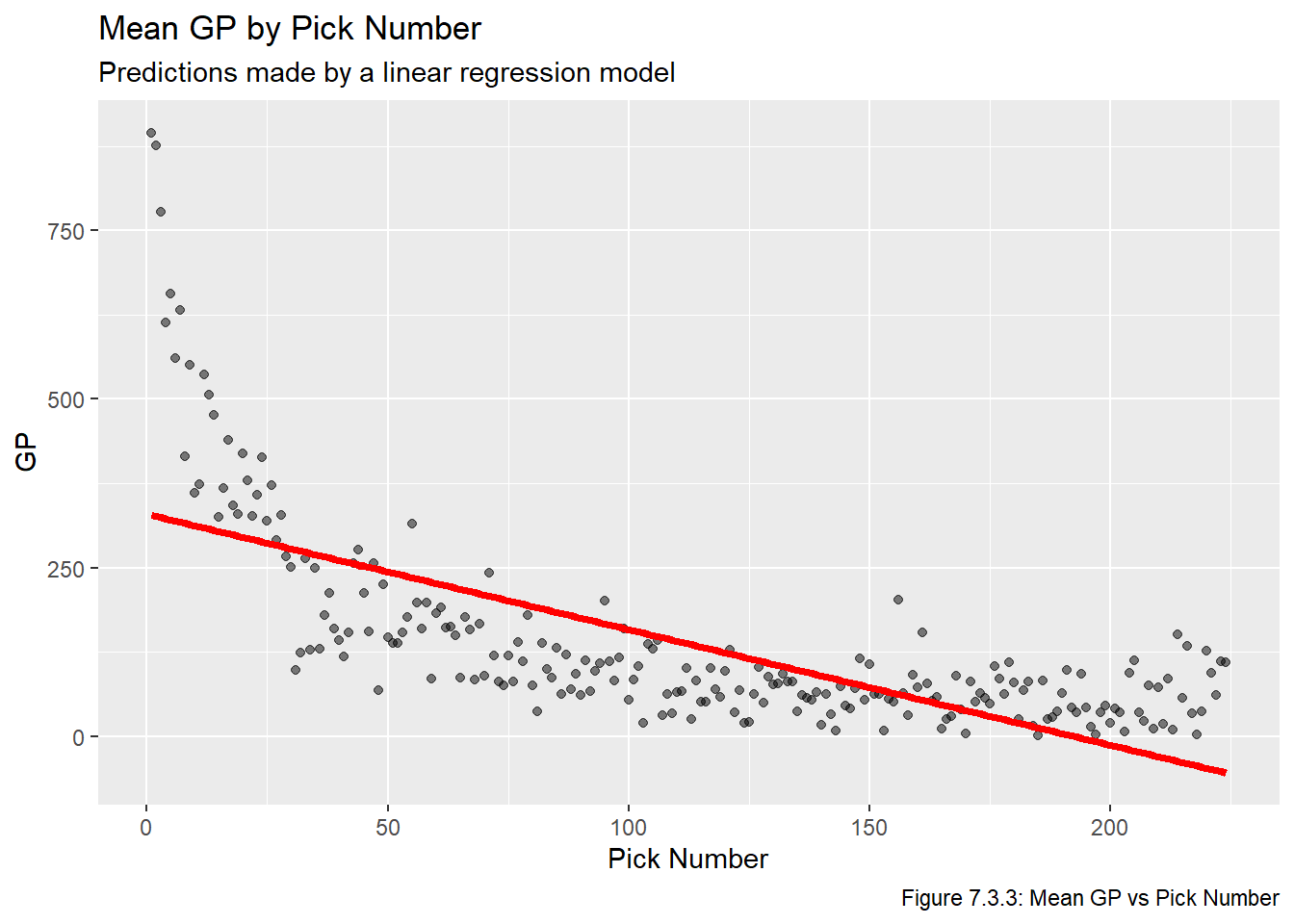
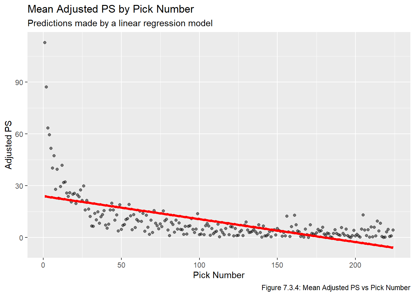
Next we plot the fitted values. Recall that in the Visualize chapter we noted that pretty much any plot involving all PS or GP values will be impossible to interpret. With this in mind, Figures 7.3.2, 7.3.3, and 7.3.4 plot the fitted lines on top of the averaged values, but note that we did not use the aggregated values to fit the model, we’re just using them for aesthetic/readability-related purposes.
Code
names <-c("PS", "GP", "Adjusted PS")for(i in1:length(metrics)){assign(str_glue("plot_{metrics[i]}"), ggplot(all_data_comb, aes_string(x ="overall", y =str_glue("mean_{metrics[i]}"))) +geom_point(alpha =0.5) +labs(title =str_glue("Mean {names[i]} by Pick Number"), x ="Pick Number", y =str_glue("{names[i]}"), subtitle ="Predictions made by a linear regression model",caption =str_glue("Figure 7.3.{i+1}: Mean {names[i]} vs Pick Number")))}for(i in1:length(metrics)){assign(str_glue("plot_lm_{metrics[i]}"), get(str_glue("plot_{metrics[i]}")) +geom_line(data = lm_pred_vals, aes_string(x ="overall", y = metrics[i]), col ="red", lwd =1.5))}plot_lm_ps
Code
plot_lm_gp
Code
plot_lm_adj_ps
Based on the plots above, all three of these linear models are pretty clearly inadequate. Moreover, all of these fail our second requirement for a feasible model, which is that all picks have a strictly positive value (sorting the predicted values in Table 7.3.1 makes this clear).
7.4 Attempt II: Logistic Regression
In this section we will fit a logistic model, which will aim to estimate the probability of a player becoming an NHL player. We follow a very similar set of steps to those in the previous section. First, we use glm to fit a logistic model.
Code
logist_model <-glm(all_data_adj$reg ~ overall, family ="binomial")
Next, we create a vector of predicted values. Recall that in logistic regression the value that predict returns is \(\hat \beta_0 + \hat \beta_1 i\), but that the probability we aim to estimate is \(\frac{1}{1+e^{-(\hat \beta_0 + \hat \beta_1 i)}}\). We therefore need to translate these predicted values into probabilities. The predicted probabilities are given in Table 7.4.1:
Table 7.4.1: Predicted Values from Logistic Regression Models
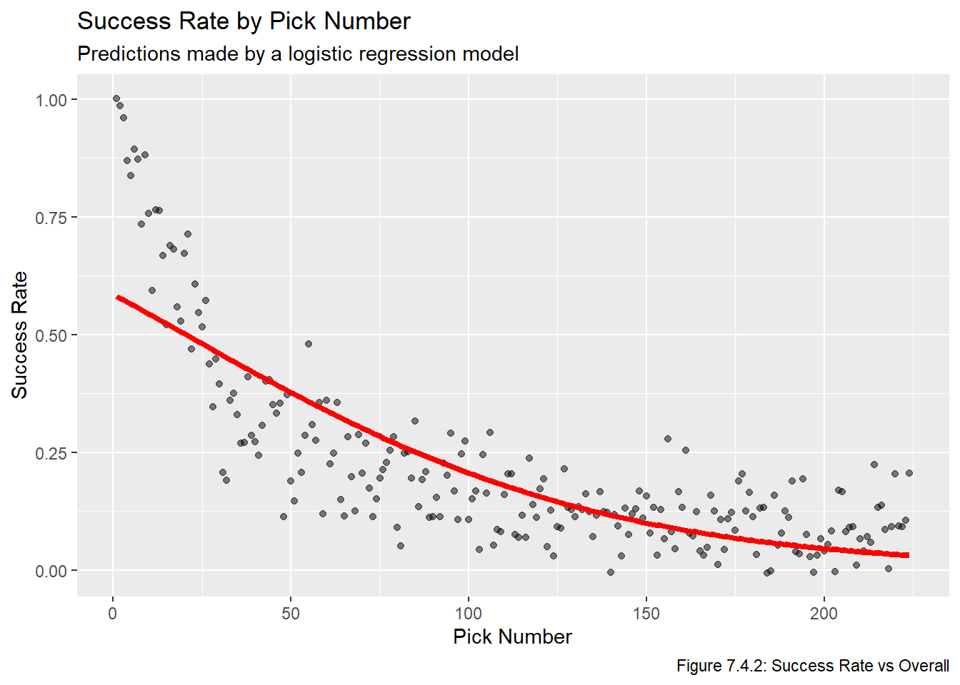
Now that we have the predicted probabilities, we plot them below in Figure 7.4.2:
Code
plot_lm_p_reg <-ggplot(all_data_comb, aes(x = overall, y = suc_rate)) +geom_point(position =position_jitter(width =0, height =0.015), alpha =0.5) +geom_line(data = logist_pred_probs, aes(x = overall, y = p_reg), col ="red", lwd =1.5) +labs(x ="Pick Number", y ="Success Rate", title ="Success Rate by Pick Number", subtitle ="Predictions made by a logistic regression model",caption ="Figure 7.4.2: Success Rate vs Overall")plot_lm_p_reg
Clearly this model is a lot better than the linear ones, but it still leaves something to be desired. Specifically, it dramatically underestimates the value of the first 75 picks (or so). We move to a more complex model. Note that this is the model that one of the Shiny apps will be based off, as will be explained later.
7.5 Attempt III: Non-Linear Regression
Given that none of the four previous models were appropriate (three linear regression-based and one based on logistic regression), we will attempt to fit a model using non-linear regression (ie the nls function, which stands for non-linear least squares). The resource Non-linear Regression in R by Childs, Hindle, and Warren (2022) was very helpful when working on this section. In short, we will be fitting the model
\(m\) is the metric being used (one of PS, GP, or adjusted PS).
\(v_{i,m}\) is the value of pick \(i\) based on metric \(m\).
\(\phi_{1, m},\phi_{2, m},\phi_{3, m}\) are parameters we are estimating, the value of the parameter depends on which metric we are using.
We choose to use nls because it allows us to directly fit a model with non-linear parameters, we do not need to transform the explanatory or response variates so it makes interpretations significantly easier. We fit the models using the same metrics as before, except for the model based on whether players become NHL regulars.
Table 7.5.1: Predicted Values from Non-Linear Regression Models
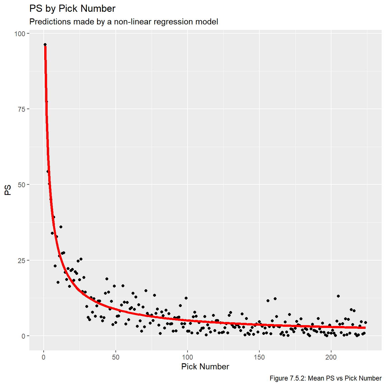
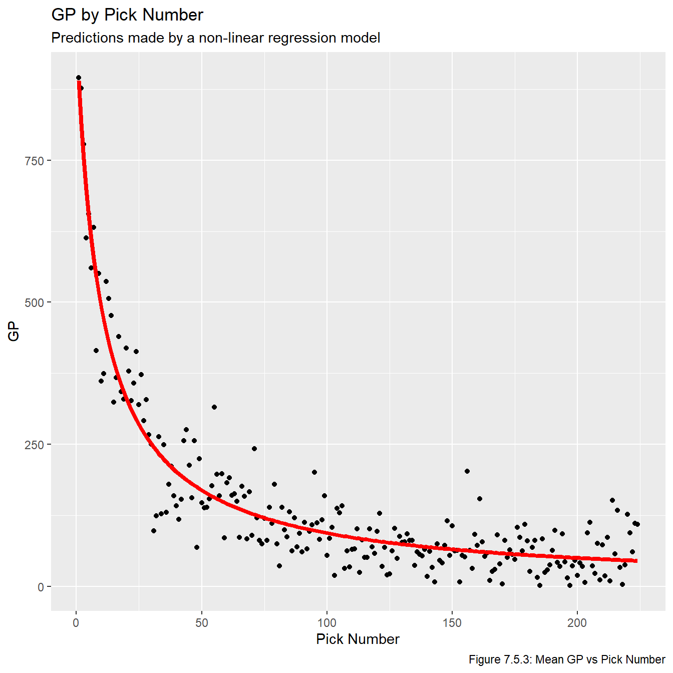
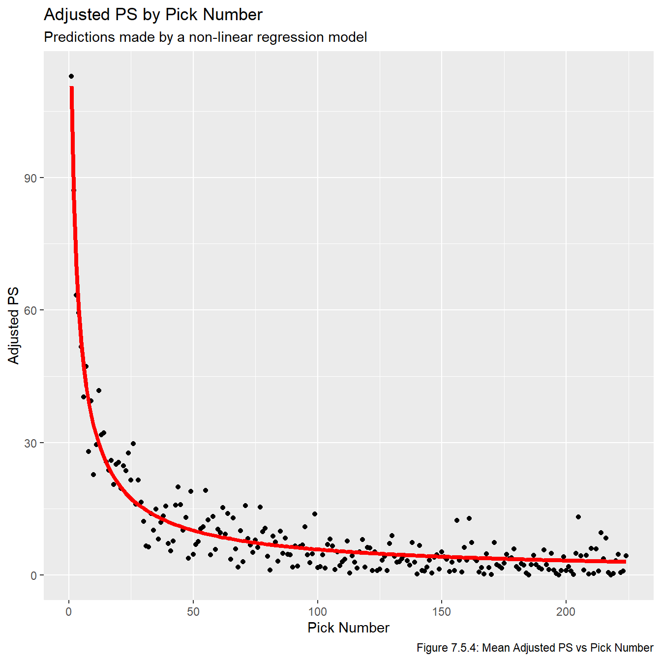
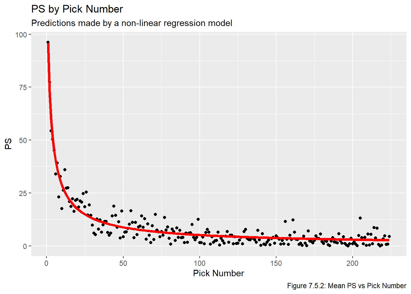
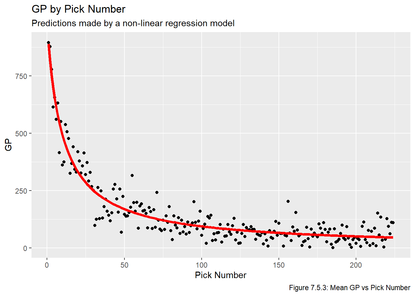
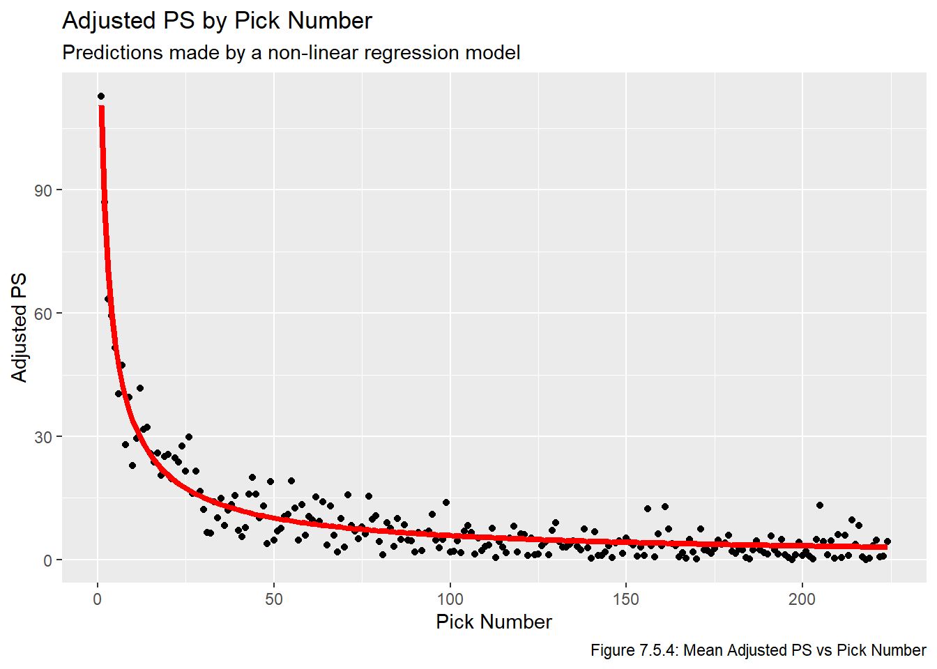
We now plot the fitted lines in Figures 7.5.2, 7.5.3, and 7.5.4. We once again use plot the lines on top of the averaged values to make the plots easier to read.
Code
for(i inseq(1,3)){assign(str_glue("plot_nls_{metrics[i]}"), ggplot(all_data_comb, aes_string(x ="overall", y =str_glue("mean_{metrics[i]}"))) +geom_point() +geom_line(data = nls_pred_vals, aes_string(x ="overall", y =str_glue("{metrics[i]}")), col ="red", lwd =1.5) +labs(title =str_glue("{names[i]} by Pick Number"), x ="Pick Number", y =str_glue("{names[i]}"), subtitle ="Predictions made by a non-linear regression model",caption =str_glue("Figure 7.5.{i+1}: Mean {names[i]} vs Pick Number")))}plot_nls_ps
Code
plot_nls_gp
Code
plot_nls_adj_ps
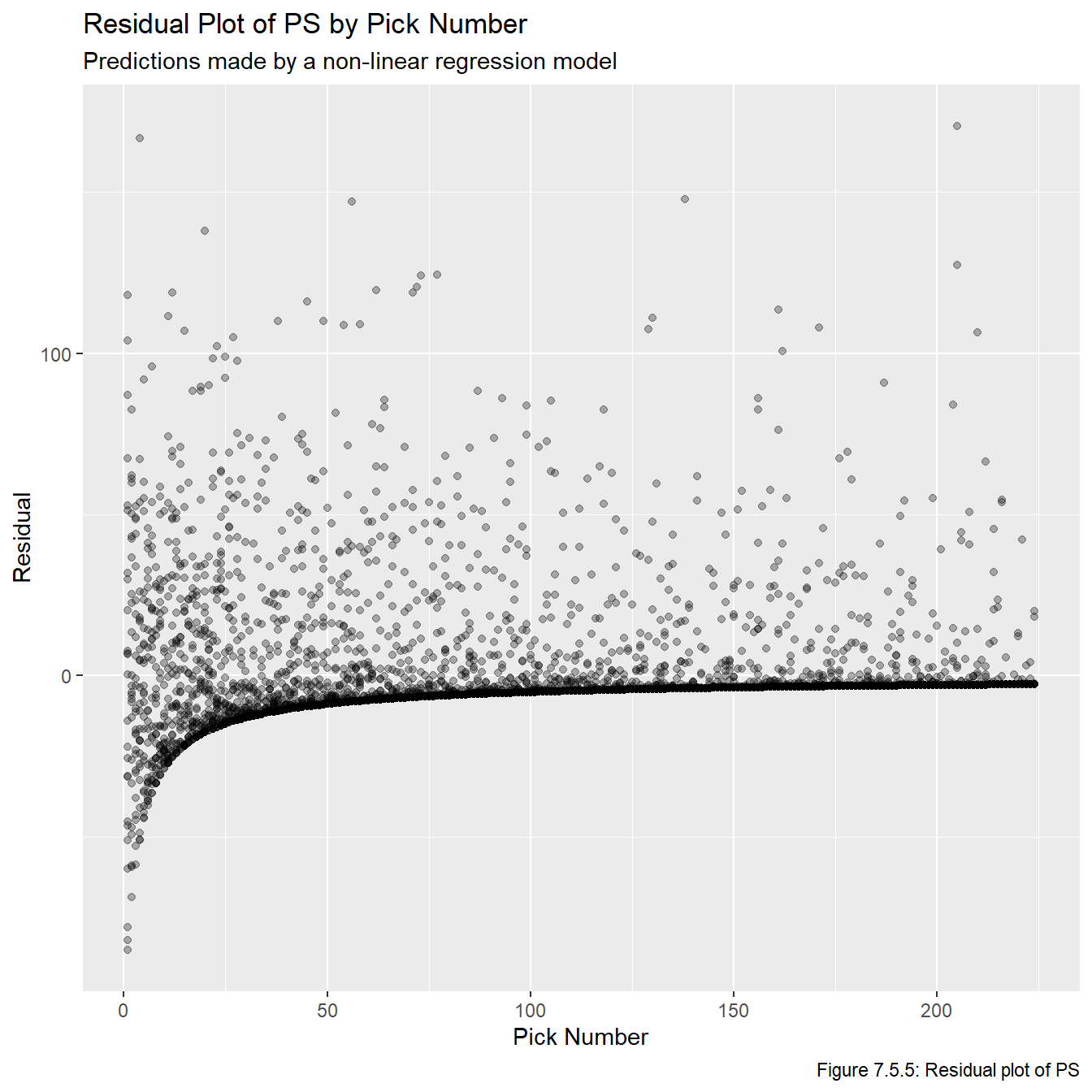
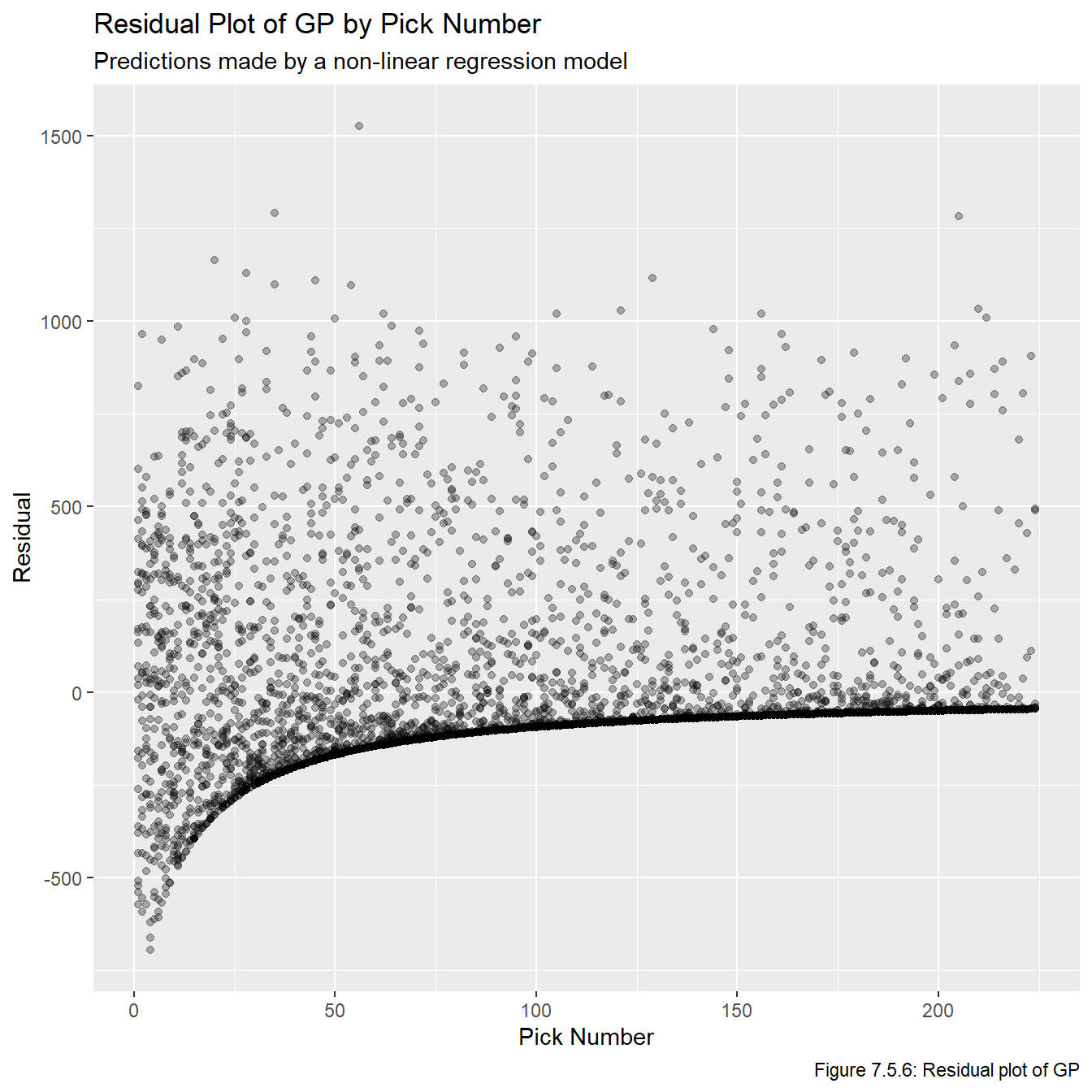
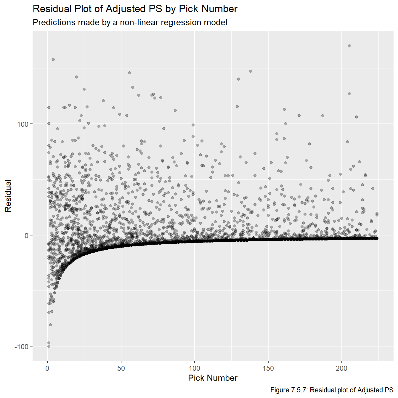
Just based on looking at these models, it’s pretty obvious that these are the three best models we have fit. Now that we have models that show promise, we plot the residuals vs overall values in Figures 7.5.5, 7.5.6, and 7.5.7 to check the model assumptions. Note that sometimes we’d plot the residual vs fitted values, but this plot is impossible to make any inferences from because so many of the fitted values are relatively small, and thus they all get clumped together on the far left part of the plots.
Code
all_resids <-data.frame(overall = all_data_adj$overall, ps_resid = all_data_adj$ps -predict(nls_ps, overall) , gp_resid = all_data_adj$gp -predict(nls_gp, overall), adj_ps_resid = all_data_adj$adj_ps -predict(nls_adj_ps, overall))for(i inseq(1,3)){assign(str_glue("plot_resid_{metrics[i]}"), ggplot(all_resids, aes_string(x ="overall", y =str_glue("{metrics[i]}_resid"))) +geom_point(alpha =0.3) +labs(title =str_glue("Residual Plot of {names[i]} by Pick Number"), x ="Pick Number", y =str_glue("Residual"), subtitle ="Predictions made by a non-linear regression model",caption =str_glue("Figure 7.5.{i+4}: Residual plot of {names[i]}")))}plot_resid_ps
Code
plot_resid_gp
Code
plot_resid_adj_ps
Figures 7.5.5, 7.5.6, and 7.5.7 reveal that the models clearly fail a number of the model assumptions, most notably the assumption regarding the residuals having a constant variance. However, given the context we are working in, this is not really that surprising and is not a major cause for concern. Notice that pretty much any feasible model will show the same general pattern for at least a few reasons. First, there is no upper bound on our residuals since (in theory) players can play in infinitely many games or generate infinite PS. However, there is a lower bound on them because if a player never plays in an NHL game and/or never generates any PS, then the associated residual will be the negative predicted value. That is, there is a limit to how much a player can underperform relative to draft position (since we don’t allow negative PS and negative GP is not possible), but there is no limit to how much they can overperform. One other thing to note is that, generally speaking, there seems to be more variance among earlier picks than later picks. This also makes sense because earlier picks can over or underperform a lot, while later picks can overperform a lot or underperform a little (because their expectations are lower, even if they do nothing they didn’t underperform that much).
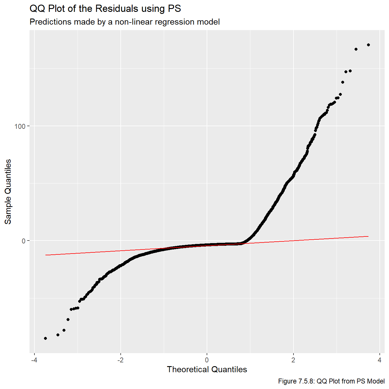
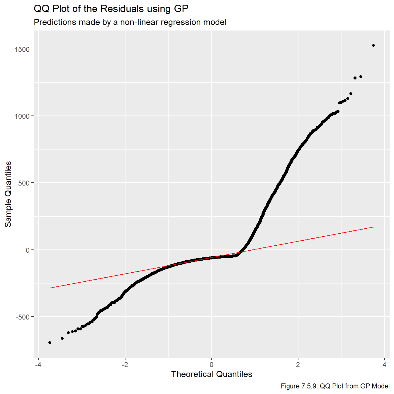
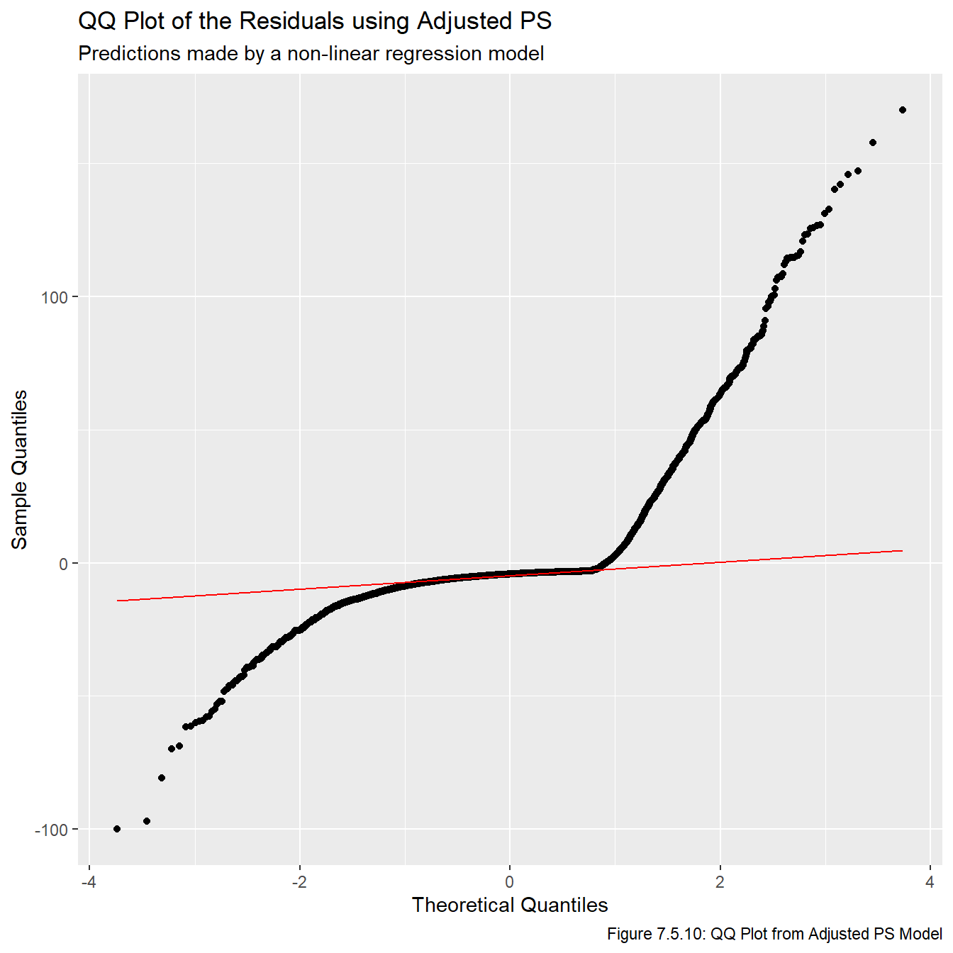
for(i inseq(1,3)){assign(str_glue("qq_{metrics[i]}"), ggplot(all_resids, aes_string(sample =str_glue("{metrics[i]}_resid"))) +stat_qq() +stat_qq_line(col ="red", lwd =0.5) +labs(title =str_glue("QQ Plot of the Residuals using {names[i]}"), subtitle ="Predictions made by a non-linear regression model",x ="Theoretical Quantiles", y ="Sample Quantiles", caption =str_glue("Figure 7.5.{i+7}: QQ Plot from {names[i]} Model")))}qq_ps
Code
qq_gp
Code
qq_adj_ps
Clearly the residuals are not normally distributed. This is another result of the points mentioned above, that there is a lower bound on a player’s underperformance, but no upper bound on how much they can overperform.
The lesson to take from these plots is that deriving confidence intervals or calculating p-values is almost certainly a bad idea because the assumptions that those mechanisms rely on are clearly invalid. On the other hand, taking point estimates is probably okay since we effectively found a curve of best fit which doesn’t rely on any of the model assumptions. With this in mind, we will be relying on the point estimates given by this model for the remainder of this report.
7.6 Model Selection
For convenience, we replot Figures 7.5.2, 7.5.3, and 7.5.4 from the last section.
Code
plot_nls_ps
Code
plot_nls_gp
Code
plot_nls_adj_ps
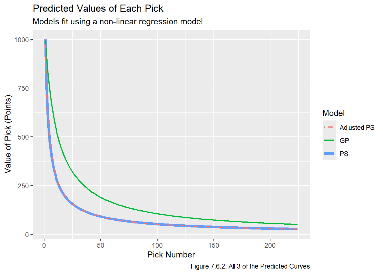
One problem with these plots is that they’re all on different scales, which makes comparing models very difficult. To maintain consistency with existing work, we hope to fit a model so that \(\hat v_1 = 1000\) “points”. To do this, we set \(C_m = \frac{1000}{\hat v_{1,m}}\), and then multiply all of the other \(\hat v_{i,m}\) values by \(C_m\) for \(i \not= 1\), and then use reactable to make sure it worked. The results are given in Table 7.6.1
This seems to look good. Now that the predicted values are on the same scale, we plot them on top of each other in Figure 7.6.2:
Code
ggplot(scaled_vals, aes(x = overall)) +geom_line(aes(y = ps, col ="PS"), lwd =1.75) +geom_line(aes(y = gp, col ="GP"), lwd =0.75) +geom_line(aes(y = adj_ps, col ="Adjusted PS"), lwd =0.85, lty =4) +theme(legend.position ="right") +labs(x ="Pick Number", y ="Value of Pick (Points)", title ="Predicted Values of Each Pick", subtitle ="Models fit using a non-linear regression model", caption ="Figure 7.6.2: All 3 of the Predicted Curves", col ="Model")
Figure 7.6.2 reveals that the PS and Adjusted PS lines are interestingly almost directly on top of each other, which implies that the adjustment we made had little impact on the predictions. We can also compare the residual sum of squares without rescaling all the values and refitting the models by simply multiplying the RSS values by the appropriate \(C_m\).
Code
summary(nls_ps)
Formula: all_data_adj[[i + 4]] ~ SSlogis(log(overall), phi1, phi2, phi3)

Parameters:
      Estimate Std. Error t value Pr(>|t|)
phi1 162.40720   20.72857   7.835  5.6e-15 ***
phi2   0.44022    0.28595   1.540    0.124
phi3  -1.21381    0.05159 -23.527  < 2e-16 ***
---
Signif. codes:  0 '***' 0.001 '**' 0.01 '*' 0.05 '.' 0.1 ' ' 1

Residual standard error: 18.05 on 5422 degrees of freedom

Number of iterations to convergence: 2
Achieved convergence tolerance: 1.614e-06
Code
summary(nls_gp)
Formula: all_data_adj[[i + 4]] ~ SSlogis(log(overall), phi1, phi2, phi3)

Parameters:
      Estimate Std. Error t value Pr(>|t|)
phi1 983.47691   53.06846   18.53   <2e-16 ***
phi2   2.30269    0.13060   17.63   <2e-16 ***
phi3  -1.02498    0.04346  -23.59   <2e-16 ***
---
Signif. codes:  0 '***' 0.001 '**' 0.01 '*' 0.05 '.' 0.1 ' ' 1

Residual standard error: 233.1 on 5422 degrees of freedom

Number of iterations to convergence: 3
Achieved convergence tolerance: 7.857e-07
Code
summary(nls_adj_ps)
Formula: all_data_adj[[i + 4]] ~ SSlogis(log(overall), phi1, phi2, phi3)

Parameters:
      Estimate Std. Error t value Pr(>|t|)
phi1 179.18880   19.86941   9.018   <2e-16 ***
phi2   0.56971    0.24867   2.291    0.022 *
phi3  -1.18730    0.04728 -25.111   <2e-16 ***
---
Signif. codes:  0 '***' 0.001 '**' 0.01 '*' 0.05 '.' 0.1 ' ' 1

Residual standard error: 19.83 on 5422 degrees of freedom

Number of iterations to convergence: 2
Achieved convergence tolerance: 6.537e-07
Given the choice between a metric using PS and one using GP, we prefer to use a metric based on PS for a few reasons.
PS credits players for contributing to their team, whereas GP gives credit for being good enough to play for a team.
The RSS associated with the model with GP is meaningfully higher than the RSS for both of the PS-related models.
While both metrics are right skewed, in this context we prefer a metric which has a longer right tail since this will allow us to distinguish good players from elite players. It was shown near the start of the Visualize chapter that the maximum of the GP data is around 6 standard deviations from the mean, whereas the maximum of the PS data is almost 10 standard deviations away. This is not that surprising since there is a hard cap on how many games a player can play in a certain time frame, but the limit on PS is impossible to reach (a player would have to win every game in his career and be fully responsible for each and every win). In other words, if two players each played in 82 games per season for 10 seasons before retiring, they would both have played in 820 games, but their PS values could be quite different, indicating that PS is a more distinguishing metric.
The PS formula includes time on ice, which tends to be a better measure of player involvement than GP. For example, Player A who plays 20 minutes a night and and Player B who plays 10 minutes a night may have the same GP, but Player A would likely be considered more valuable because he plays twice as much.
Now that we’ve settled either using PS or Adjusted PS, we take a closer look at the difference between their predicted values. The mean disparity between the two predicted values is about 1.04, which indicates the metric we choose is unlikely to significantly impact our conclusion since picks are values out of 1000. Note that we need to take the absloute value since the since the scaled version of Adjusted PS may be smaller than the scaled PS values (even though the unscaled adjusted PS values are always greater than the scaled PS values).
Code
mean(abs(scaled_vals$adj_ps - scaled_vals$ps))
[1] 1.044389
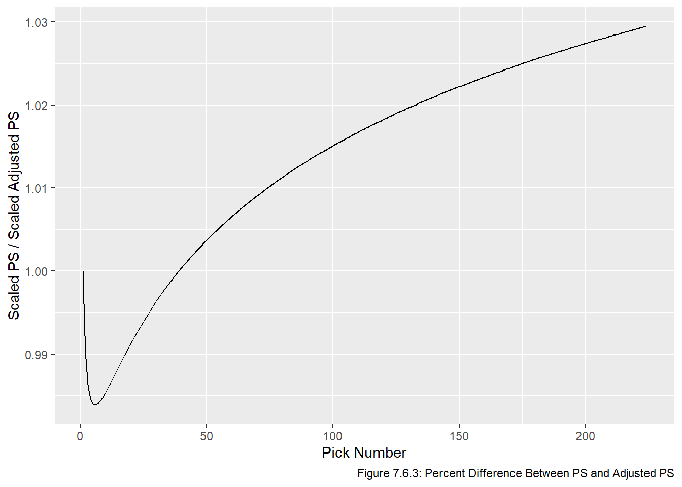
We can also plot the percent differences, as is done in Figure 7.6.3:
Code
ggplot(scaled_vals, aes(x = overall, y = ps / adj_ps)) +geom_line() +labs(x ="Pick Number", y ="Scaled PS / Scaled Adjusted PS", main ="Percent Difference Between PS and Adjusted PS", caption ="Figure 7.6.3: Percent Difference Between PS and Adjusted PS")
We can see in Figure 7.6.3 that percentage-wise, most of the variation between the PS and Adjusted PS values occurs late in the draft. However, these these picks are still very close in raw point values since 3% of a relatively small number is a small number. With this in mind, we choose the model based on PS (not adjusted PS). As the analysis in this section has showed, there is almost zero difference between the models based on PS and adjusted PS models. Therefore we prefer to use the simpler model, which in this case is PS. The RSS values for both models are fairly close so even though the RSS is smaller for adjusted PS, we will base the remainder of this report on the model based on PS.
7.7 Finishing Touches
To make the rest of this report and Shiny app simpler, we will refit the model with the scaled PS values:
Formula: scal_ps ~ SSlogis(log(overall), phi1, phi2, phi3)

Parameters:
       Estimate Std. Error t value Pr(>|t|)
phi1 1695.81037  216.44187   7.835  5.6e-15 ***
phi2    0.44022    0.28595   1.540    0.124
phi3   -1.21381    0.05159 -23.527  < 2e-16 ***
---
Signif. codes:  0 '***' 0.001 '**' 0.01 '*' 0.05 '.' 0.1 ' ' 1

Residual standard error: 188.5 on 5422 degrees of freedom

Number of iterations to convergence: 2
Achieved convergence tolerance: 1.614e-06
We now create two functions which will be used in our R Shiny app. The first is value, which takes in a pick and returns the number of points (a more user-friendly version of predict), and the second is pick, which takes in a number of points and returns the closest pick to that number of points. Recall we fit the model \[ v_{i,m} = \frac{\phi_{1, m}}{1+ (\frac{e^{\phi_{2,m}}}{i})^{1/\phi_{3,m}}} \]and from the R output above we have \(\phi_{1,m} = 1695.81037, \phi_{2,m} = 0.4402, \phi_{3,m} = -1.21381\). Creating the value function is now straightforward.
Code
phis <-unname(coef(nls_scal_ps))phi_1 <- phis[1]phi_2 <- phis[2]phi_3 <- phis[3]value <-function(overall){ phi_1 / (1+ (exp(phi_2) / overall)^(1/ phi_3))}# check it worked:value(1) # should be 1000
[1] 1000
Code
value(224) # should be approx 27.762
[1] 27.7623
The pick function is more complex, we need to take the inverse of the value function. It’s not a difficult computation, but it’s a few steps so we omit the derivation, it turns out the inverse is given below:
\[
i = \frac{e^{\phi_{2,m}}}{(\frac{\phi_{1,m}}{v_{i,m}} - 1)^{\phi_{3,m}}}
\]
Code
pick <-function(value){round(exp(phi_2) / ((phi_1 / value -1)^phi_3))}# check it worked:pick(1000) # should be 1
[1] 1
Code
pick(27.76) # should be 224
[1] 224
Code
i <-seq(1, 224)all(pick(value(i)) == i) # this should be TRUE
[1] TRUE
Note that the value and pick functions we implemented in R are not perfect inverses of each other because of the use of round, but for the purposes of our R Shiny app this will not be an issue.
We can see that this difference is about 39 points, which is equivalent to Pittsburgh receiving a mid 5th round pick in surplus value. This seems about right, it is widely accepted that the team that acquires the highest pick almost always gives up more than they receive. This is why teams only trade up if they really like a player who is available at the current pick, while also thinking that the player will not be available at their next pick.
Finally, we create a data frame of predicted values and store it in our S3 bucket:
We now store the model and data in an S3 bucket so we can access them later if needed. Note that some of the steps given on DevOps for Data Science were in Python, I found the equivalent R steps here. Since vetiver cannot be used for nls objects, we will use it on the logistic model using success rate to show that I know how to do it. There will be 2 versions of the app, one using the logistic model (which satisfies the devops requirements) and one using the nls model (which has objectively better predictions, as explained earlier in this chapter).
Creating new version '20250812T015507Z-69ecb'
Writing to pin 'logist_model'

Create a Model Card for your published model
• Model Cards provide a framework for transparent, responsible reporting
• Use the vetiver `.Rmd` template as a place to start
We now proceed to the Communication chapter, which sumaarizes the key results from this report and explains how to use the Shiny app.